The 2022 President’s Collection Highlight Series Shares What Makes a Yearbook Great – Part 4
As we enter the fourth week of March, we’re excited to bring you the President’s Collection, Part 4! In this post, we share highlights from the yearbooks of Colonial Forge High School, Rock Ridge High School, Blue Valley Northwest High School, Alexander W. Dreyfoos School of the Arts, University High School, El Dorado High School and Lexington High School.
Yearbook experts Mike Taylor, CJE, Jim Jordan and Sabrina Schmitz, CJE, discussed what makes the yearbooks in our 2022 President’s Collect great – and we recorded their conversation. We’ve shared snippets below, but be sure to check out our gallery for the full video for each of the 31 schools in our President’s Collection. Each of these videos focuses on five main areas of a school’s yearbook: concept and theme, coverage, design, writing and editing, and photography. Yearbook staffs can use these videos and the accompanying assessments to reflect on each of the five areas. This will help them identify quality elements, reflect on their own work and chart a course for improving the 2024 book.
Part 1, Part 2 and Part 3 of the series have been posted. In addition to the teasers below, you can find more information on our Instagram, Twitter and Facebook social media sites. The full reviews are five to 15 minutes long and available to watch at walsworthyearbooks.com/presidents-collection-webinar.
Colonial Forge High School, Stafford, Virginia
The Colonial Forge High School Apollo used a loud design for their 2022 yearbook, which had the theme “A Little Bit Extra.” The UV grit laminate material on the words “extra” gives a sandpaper feel that adds to the sensory experience. The contemporary cover uses a neon green spot color ink paired with a navy color as a neutral.
“If it were black, or gray or white – we see that all the time. Play with the color! If you’re going to go extra, go extra,” Schmitz said.
The book’s design was inspired by magazines from Japan, Germany and Norway. The trio praised the Colonial Forge yearbook staff for pushing boundaries in design and thinking outside of the box. By seeking inspiration from unconventional sources and experimenting with color and design elements, the Colonial Forge High School book was able to stand out and make an impression on its audience.
Rock Ridge High School, Ashburn, Virginia
The 2022 Rock Ridge High School Genesis has a modern and cool vibe. The yearbook features a dark cover with layered photos. The words of the theme, “Admit It. You Love It.” are done in a blind silkscreen that conveys a sense of movement. The theme phrase is something that the student body of Rock Ridge High School frequently say.
One of the thoughtful touches is the placement of letters on top of the cover photo. The Y and O of “you” perfectly frame two individuals’ faces.
“I’ve seen way too many times, type and graphics get slapped on someone’s face or covering part of someone’s face,” said Schmitz. “They’re doing a great job of using the type to actually drive your eye to the faces, to the people in the photo.”
Taylor, Jordan and Schmitz were impressed with how the book carried through with its theme. They also gushed over an all-text spread featuring quotes from different students. This was an excellent way to expand the number of students covered in the yearbook.
Blue Valley Northwest High School, Overland Park, Kansas
The theme of the 2022 Horizon was “How ‘Bout Now?” The use of ‘bout instead of about reflects the way people at their school actually speak. Taylor, Jordan and Schmitz praised the yearbook for its simplistic yet gorgeous design, from the white cover with simple color choices to the consistent use of a super wide bar that was first introduced on the cover. That bar was carried consistently throughout the book’s design, but it never obscured in-focus faces or critical information. Blue Valley Northwest is known for their strong photography, which showed in the 2022 yearbook.
“I love it. I just absolutely love this. I like the way that the copy reads. I love the gold against that fire,” Taylor said about a theme page featuring students gathered around a bonfire. “I just like the color choices on all of this. The fact that we’re going to put a ‘Beat Southwest’ sign in the fire? Brilliant. Love this photo. And that framing.”
Alexander W. Dreyfoos School of the Arts, West Palm Beach, Florida
The Marquee’s 2022 theme, “So Many Questions, Finding Our Answers” reflects the high-stress atmosphere of the school, which students audition for to attend. It focuses on the idea that everyone is finding their answers in their own way.
The cover is simple, with gold text on a black background. The book’s four theme spreads feature a UV coating that adds depth and texture to the photos. That treatment means this is a book that is even better in person due to the tactile nature.
“I remember looking at these going, ‘Wow, very pretty, but very simple.’ And then when I saw the book and physically held it and I saw that, I was like, ‘Oh, wow,’” Schmitz said.
The book’s design is centered on the students’ experiences, showcasing their talents and strengths. The yearbook uses gorgeous photography and elegant serif fonts, then changes it up for the spread that won NSPA’s Design of the Year. The two-spread package about the fall dance brings in neon green text and new font choice, but still ties together with the spreads that came before as part of a spread package.
University High School, Orange City, Florida
Odyssey incorporates a cool Florida vibe with the colors and theme, “What About It?” The cover is orange with a little bit of gray and a citrus green in the lettering. Taylor, Jordan and Schmitz praised the use of contrast from the cover to the end sheets, where the colors were inverted. They liked the nice, clean font and the contrast between the thick and thin sans serif fonts. The title page kept information like the table of contents small.
The yearbook staff created three different theme spreads, each with a different focus. The designer played with the font throughout, but still kept it consistent.
“They do some outline with white, they do some outline with blue. They do the thinner version of it. I mean, every single book that we have done has used their font and their type to convey their message. And done a great job,” Taylor said.
El Dorado High School, El Paso, Texas
The Legend used a unique color combination in their 2022 yearbook: brown and pink. The theme was “Becoming.” They used those colors on the cover of the book but made the spine white.
“I personally love the whole the whole idea of using the brown as a neutral. I thought it was really, really smart and different. You see a lot of black, white and gray books. That’s always the neutrals that we go to. This is still acting like a neutral, but it’s a different neutral,” Schmitz said.
The staff carried their color scheme even further by mixing in sepia-toned photos. They also used a photo treatment Taylor refers to as the “paper doll effect,” which has an outline around the shape of a cutout. Another inclusive coverage choice was to feature a students in the corner of spreads with a quote about who and what they are becoming. It was a subtle nod to the theme and added more students to the yearbook.
Lexington High School, Lexington, Nebraska
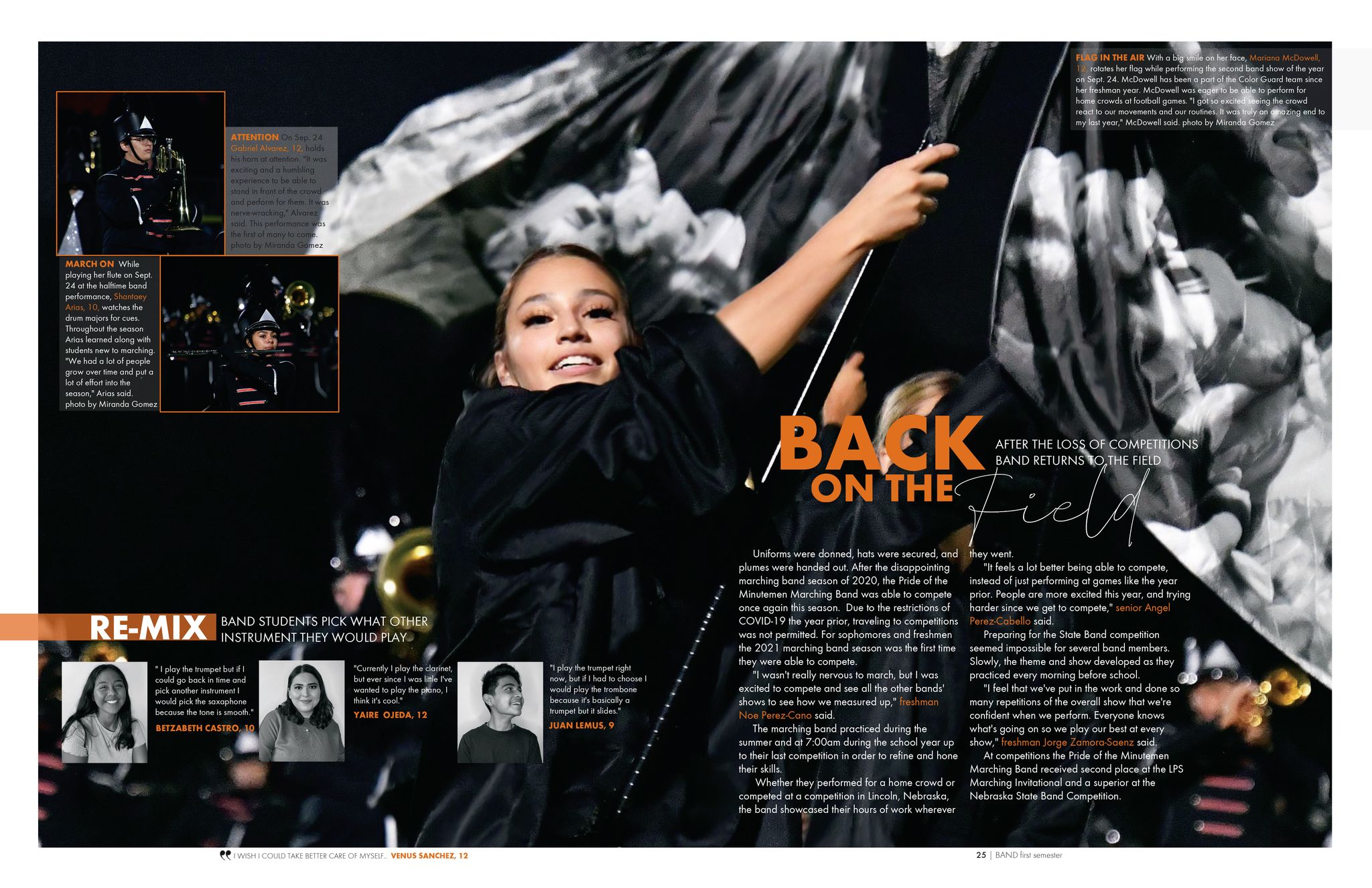
Lexington High School may be small, but The Minuteman is a mighty yearbook! The yearbook staff kept the book simple and used cost-saving measures like white endsheets. However, the time and thoughtfulness put into the design puts this book at the same level as schools with large student populations and bigger budgets.
One of the design elements that stands out is the use of a striking orange bar that goes over a photo on the title page, giving the photo a duotone feel. They play around with margins, cutouts and page bleeds throughout the entire book. Mixing these up gives their spreads an added depth.
The staff carries their theme, “Note to Self,” throughout the book. Rather than simply naming it the table of contents, it’s “Noteworthy First Semester Contents.”
On a spread that utilizes several quotes, they played around with the width to enhance the design.
“Make it make it work for you on the spread,” Schmitz said. “I think there was a time where a lot of this stuff was very stiff with rules, and it’s good to know that rule so that you’re not all over the map. But if it fits better for a spread to stretch that out so you’re getting things lined up and it’s longer than some of the other captions, I think that works.”
Want more?
Taylor, Jordan and Schmitz covered much more than the books listed above. They reviewed each of the 31 books in our 2022 President’s Collection. Those five-to-15 minute videos are being released throughout the month of March. In addition to the President’s Collection, Part 4, and the previous three posts, we have two more blog posts on the schools in our 2022 President’s Collection planned for March.
Tag:Award Winners


