Picking print-worthy photos
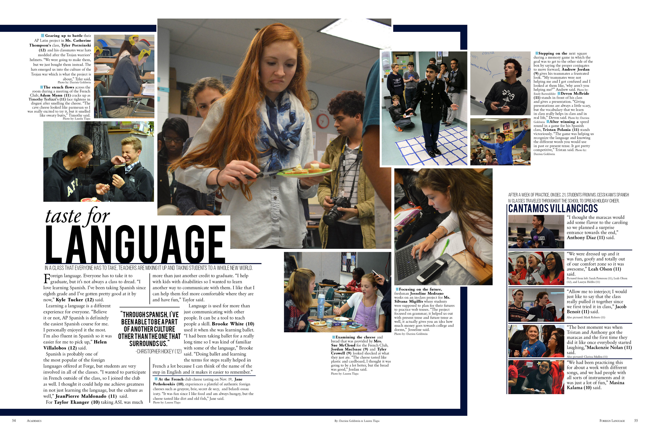
Students need to select the best story-telling photos for their spreads. The advice here will help your students with their remaining deadlines, or if your book is complete, can be used to train your next staff.
At a major school event, hundreds of photos may be taken in just an hour. After you’ve sorted out the good from the bad and eliminated problems of focus, lighting or poorly timed shots, how do you identify the best from the good?
It begins with theme.
A good theme drives coverage, from the designing to writing and photographing. A playful theme might look for photos full of laughter or ones that capture zany moments. A traditional theme might focus on momentous moments and milestones. Does your theme focus on individuals? You’ll need a lot of photos of a single person in action. Will your yearbook be all about connectivity? Make sure you get photos of people interacting.
Before you place your dominant photo, you need to identify the angle of your story. The dominant photo, headline and copy package must match thematically. What is the story you’re trying to tell? What moment captures that story?
Sometimes the dominant stands out. It’s got action and reaction; it’s the peak of the action, and has good composition and great lighting. Otherwise, selecting photos is often a matter of taste, something young photographers are still developing. The sorting process is a great opportunity for staffers and editors to work together to develop the story and discuss the photos available. You may end up altering the story approach if you snagged a fantastic photo.

After you’ve selected your dominant, it’s time to assess the rest of your available photos. Use whatever sorting practice works best for you so you don’t have to go through all 500 photos that you took at the event and can focus on the 15 or so that are truly usable.
Tip: If your computer has Adobe Photoshop installed, you have Adobe Bridge. Bridge is a great program to sort and select your images prior to placing them. It has four different preview modes, the ability to rank by starring, and contains metadata like shot date that are helpful when writing captions. See “What Bridge can do for you” at walsworthyearbooks.com or check out my YouTube video for a breakdown of how to use Bridge.
Figure out what photos tell the rest of the story of the event. Then, look for patterns or potential collections. Each collection of photos on a page ̶ whether it’s the dominant and secondary photos, or a photo modular package ̶ should tell a cohesive story. Four photos of students dancing at the homecoming dance should not be packaged with one photo of students eating at IHOP after the dance. The stories aren’t the same, so they need to be separated visually on the page.
However, by replacing additional photos of students dancing with other activities and events that happened around homecoming, you alter the main story to be more than just dancing, so the IHOP photo would work.
Like I said, the selecting of photos is complicated and a great time for students to work together.
Once you’ve narrowed down your photos to three or four more than you have photo boxes, consider the following criteria to ensure interest in your spread:
- Diversity of action: Do you have a variety of actions on your spread? Have you covered the before, during and after of the moment? Are people looking in different directions?
- Diversity of number: It’s easy to shoot photos of one person at a time, but a collection of photos with no interactions can lack energy. Single-subject photos show focus and individual achievements. Two-subject photos show interaction and reaction. Three or more subjects give the reader context and a strong sense of place. Most spreads need all three.
- Diversity of crop: Don’t crop every photo the same way. Use wide, medium and close shots.
- Diversity: Make sure your photo selections accurately represent the diversity of your school. Not only gender and racial diversity, but the diversity of interests and cliques in your school. Set the standard and speak about it openly. I’ve seen staff members place an entire spread of photos that are nothing but girls with long, medium-brown straight hair without even noticing.

Tip: Trying to figure out why your spread isn’t working? It might be the photos. Switch out your dominant. Go through the diversity checklist to make sure your spread has tension and excitement.
Use the following “rules” when placing photos on your spread.
- All action, leading lines and leading looks should lead your viewer’s eyes into the page. This usually means making sure everyone is looking toward the gutter, though the dominant should take the reader’s eye to the headline.
- Keep faces out of the gutter. Bodies can cross the gutter, but not faces.
- When you place your photos, remember to recompose and crop. If the original photo didn’t utilize rule of thirds, fix it when you place it.
- Don’t duplicate people. Don’t place the same person on a page more than once unless it’s 100 percent unavoidable.
- Don’t crop a vertical photo to fit a horizontal template. Take the time to redesign to make the ideal dominant photo work.
Tip: Edit your photos after you place them, then replace them. Don’t edit by eye; edit using either curves or levels. You’ll have to replace the old photos after you’ve edited them, but it’s faster than editing all your photos prior to placing them.
Tag:Picture This


