Making It Work, Part 2
Staffs and advisers around the country are rising to the challenge to tell the story of this unique year in their yearbooks.
From coast-to-coast it’s been such a radically different experience for every yearbook staff. In this blog series, we take a look at what yearbooks staffs are covering and how they are structuring their pages. Check out part one and part three of the series and visit our gallery to see even more.
Florida State University Schools, Tallahassee, Florida
Shannon Axtell, adviser
Learning Model: Hybrid. It has stayed the same the whole year. Half of our students are doing virtual and half are learning on campus.
Editors/staff who worked on the pages: Gabby Carrol and Madelyn Aittima
What has been the most challenging aspect of creating pages this year? The lack of students at school.
How have you overcome these challenges? We haven’t. We are working on it as we go.
What have you learned in the process of creating these pages? Preparation and getting a schedule for pictures is key!
What advice would you give other advisers as we move into the second half of the year? Do what you can and work WITH your staff. They will amaze you.
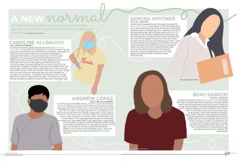 A New Normal. These spreads were created using the ProCreate app. The use of color and type contrast make the images stand out. Very effective that each drawing was not the exact same size. Making the female in the burgundy top larger than the others helps guide the reader around the page.
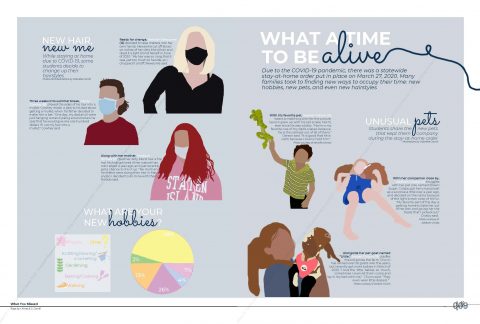
What a Time to Be Alive. Great coverage idea highlighting what was new for students during the pandemic – new hobbies, new pets, new hairstyles. Using this type of drawings of students is a great way to create a spread when photos are difficult to get.
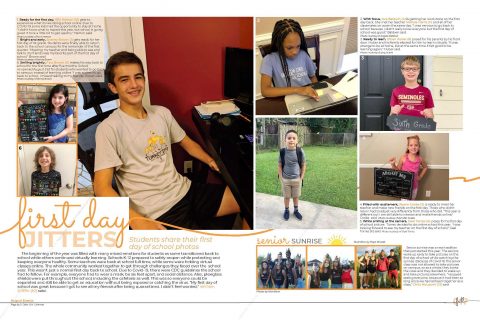
First Day Jitters. Great crowdsourced photos on the first day of schools. The use of color and type contrast add visual interest to the spread.
North Broward Preparatory School Coconut Creek, Florida
Paul Miller, adviser
Learning model: First virtual, then after one month of hybrid, going to in-person in January
Editors/staff who worked on the pages: Logan Keyes, Student Life Editor and Chloe Field, Fine Arts Editor
What has been the most challenging aspect of creating pages this year? Slow pace of page production when working virtually.
How have you overcome these challenges: We haven’t and are behind.
What have you learned in the process of creating these pages: Get all your content in the cloud and accessible to all your students.
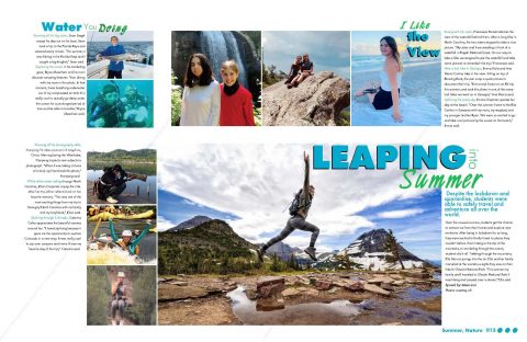
Leaping Into summer. Great summer photography gathered from students packaged into three separate mods with great use of color and contrasting type make this a great spread in any year.
Freedom High School, Tampa, Florida
Dan Sidwell, adviser
Learning model: Hybrid. We started this year off as hybrid and we are still there. The biggest challenges we are trying to work out in our class is having a handful of members of the staff at home as eLearners and the rest of the staff in person. As a school, we started out as hybrid with only about 700 (out of 1850) kids on campus. We are allowing eLearners to come back to campus and we are up to about 1150 students now. The issue with that is that we have had multiple, mass schedule changes. We would be working on the ag spread and getting close to finishing – and that kid is now out of the class. We are anticipating the same issue at the semester change in mid-January.
Editors/staff who worked on the pages. 2020-21 editors: EIC – Kyla Hoffbauer Sports Editor – Campbell Brown Student Life Editor – Becca Hoffbauer Photography Editor – Lex Mosher
What has been the most challenging aspect of creating pages this year? We are having a difficult time not replicating last year’s book. At first, it seemed like the spreads were very consistent with what was made last year. I think a lot of that had to do with not having a spring to really hammer out a visual and verbal theme and then taking that theme to camp in July. The past few years that has been when my kids really blossomed. This year, everyone was very tentative and very safe.
How have you overcome these challenges? One thing that has helped was not having any early deadlines. Our first is only 32 pages and it isn’t until December 15th, so we have had a lot of extra time to tinker and think about and change and go back and change to something else. At this point, I think we have been able to really differentiate from last year’s book and I was very, very worried that we were just making the 2020 book again. A few years ago, my former EIC Parker Ridaught said that it took until Thanksgiving his first year for everything to click. Luckily, the same thing seems to be happening this year with an entirely different group of kids.
What have you learned in the process of creating these pages? Do not get your heart set on a certain look. I have always told my kids to “let content drive the spread,” and this year that is really what is happening. We threw around a lot of ideas about how to incorporate black and white photography into the book this year and we have gone the complete opposite. We have these red and blue lights as on our features. I’ve always said that we won’t do a red, white and blue book (those are our school colors) and I thought it would be too cheesy – we are already Freedom High School and our mascot is the Patriots. The yearbook is “Glory” and the newspaper is “The Revolution.” I have always disliked how predictable all of the names and colors of the school and mascot are which was my basis for never wanting the RW&B color package but the kids made a beautiful cover and it’s RW&B but not cheesy. They’re letting the content drive the spread which is leading to a much different look than last year.
What advice would you give other advisers as we move into the second half of the year? Be patient. Do not force things. If you really really want (insert spread idea here) to happen but the photos aren’t there and the story isn’t good, move on. Don’t spend hours and days and weeks trying to clean up a mess. Delete it and move on. There are so many new and different things going on now, so cover those.
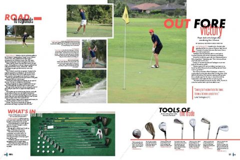
Out for Victory. Freedom High School has live sports to shoot this year! This golf spread with its modular design tells four separate stories. The mods on “What’s in Your Bag?” and “Tools of the Trade” would be great on a golf spread any year.
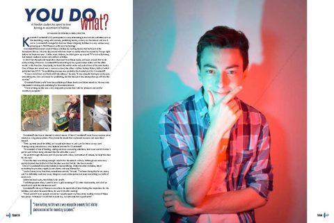
You Do What? The photo technique on the staged dominant photo provides visual interest to this spread on one Freedom student and his hobbies. Every student at your school has a story to tell. You just have to talk with them and find that story. Double page spreads on individual students are a great way to expand your coverage when normal-year events like prom and homecoming may not happen.
Deerlake Middle School, Tallahassee, Florida
Liz Snowden, adviser
Learning model: We started the year hybrid and will continue that model for the remainder of the year (at least that is the most current news). Two thirds of my staff is digital.
Editors/staff who worked on the pages: Hailey Bull (Co-EIC), Adriana Ranjabari (CO-EIC), Sofia Torres Garcia, Abby Sackett, Kate Perry
What has been the most challenging aspect of creating pages this year? The most challenging things this year have been trying to get the information to the digital staff so that they can complete pages and teaching NEW staffers who are digital!
What have you learned in the process of creating these pages? Communication is key with our digital staff. Parents of digital kids want their kids in the yearbook, but it’s super hard to get information or pictures from them. Be flexible on how much you are covering things…give PE that full spread this year, get creative with club coverage…maybe SGA get three full pages this year instead of one.
What advice would you give other advisers as we move into the second half of the year? Cover EVERYTHING…nothing is insignificant. You don’t have to use it all, but you might need it.
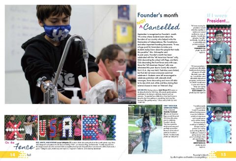
Founder’s Month Not Cancelled. Modular design, type contrasts and strong use color tie this spread together.
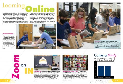
Zoom on In. Beautiful use of vibrant color, a great dominant photo, multiple layers of coverage and use of white space make this a strong layout.
See more spreads
Be sure to check our 2021 Coverage Gallery to see more examples of how yearbook staffs are creating books in this strange year. You can also check out parts one and three in this series.

