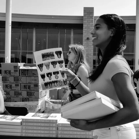
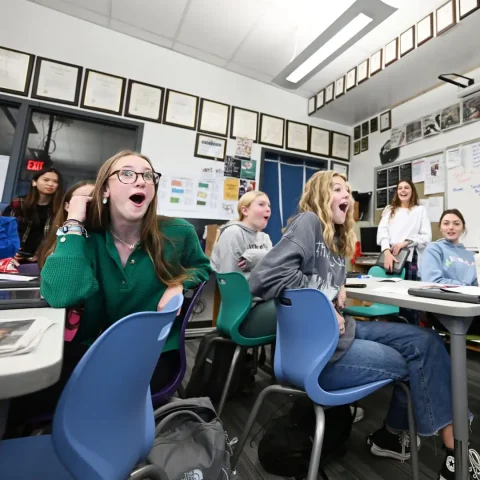
As the month of March continues, we’re continuing to highlight yearbooks in our 2022 President’s Collection. Yearbook experts Mike Taylor, CJE, Jim Jordan and Sabrina Schmitz, CJE, discussed what makes the yearbooks in our 2022 President’s Collect great – and we recorded their conversation. We’ve covered six schools in the 2022 President’s Collection, Part 3.
Each video focuses on five main areas of a school’s yearbook: concept and theme, coverage, design, writing and editing, and photography. Yearbook staffs can use these videos and the accompanying handouts and quizzes to reflect on each of the five areas and identify quality elements, reflect on their own work and chart a course for improving the 2024 book. Part 1 and Part 2 of the series have been posted. In the 2022 President’s Collection, Part 3 blog post, we take a look at Palo Alto High School, Gulliver Preparatory Upper School, Legacy High School, Timber Creek High School, Athens Drive Magnet High School and El Roble Intermediate School.
We’ve shared teasers below and on our Instagram, Twitter and Facebook social media sites. The full 2022 President’s Collection reviews are five to 15 minutes long and available to watch at walsworthyearbooks.com/presidents-collection-webinar.
Palo Alto High School, Palo Alto, California
Palo Alto’s 2022 yearbook, “It’s Our Move,” made excellent use of colors, font and layout. They chose a pink color scheme and a retro font.
“It has that Candyland feel. It reminds you of your youth, but it is fresh because of the color and the type usage,” Jordan said.
Their main font has a strong 60s/70s feel with a modern twist. A consistent color scheme and font choice keep the different spreads feeling connected.
The staff did a great job of telling the story of the year. They covered the students, but also included parents, teachers and other members of the community. The yearbook staff showed creativity, storytelling skills, and good use of design.
Gulliver Preparatory Upper School Campus, Miami, Florida
The Raider yearbook used a split cover in 2022, one with a blue/green color scheme and one with a pink/orange color scheme. The colors from both covers are tied together in the front endsheet. The blue and green shows up in the page number listed there, and the pink and orange shows up in their theme, “It’s All Good.” The students added the words “Find. Do. Be.” to emphasize a progression throughout the book.
On the title page, a white border surrounds a photo of a student on a trapeze, but the student is partially cut out of the photo and interrupts that border.
“The fact that he is kind of popping out of the frame of that photo and bleeding off the edge and – guys, when you use photos to help drive your eye to content on the spread, there is not a greater moment for me. I love when I see that happen because it shows that you’re really working to tell the story,” Schmitz said.
The staff carried consistent design elements throughout the book, like a thin line and photographs that interact with the content. Although the line shows up throughout the book, its placement is often slightly different to add a unique element to each spread.
Legacy High School, Mansfield, Texas
The Arena chose the theme “Black, White and Red All Over” for their 2022 yearbook. This reflects the school colors.
It’s difficult to fully appreciate the book through photos, as it’s very tactile. The background of the cover is printed on grit UV and the red cutouts of students are printed on clear silkscreen, which is smooth.
“You have to feel the indents and the emboss and blind deboss,” Taylor said.
The book includes desaturated photos throughout. They also use red duotones, which is often cautioned against, but this is an example of a time breaking the rules worked for a yearbook staff.
One of the thoughtful details carried throughout the book is a reflection of their theme. The pages have a black bar at the top and a red bar at the bottom. When holding the book closed in your hands, the top will look black, the side will look white, and the bottom will look red.
“So the book is literally ‘Black, White and Red All Over.’ Smart, thoughtful theme stuff,” Schmitz said.
Timber Creek High School, Fort Worth, Texas
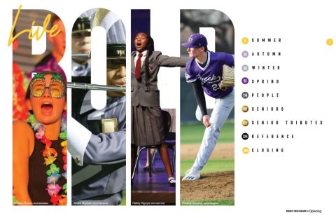
The theme of The Creek in 2022 was “Live Bold. Stay Gold.” They use purple and gold on their cover and the box that encases the book. The endsheets are solid purple and the staff chose not to put any words or design on them.
“They decided to be bold and just have it be their incredible purple,” Jordan said.
The cover and box use design elements that look like gold confetti. The title page continues that with a photo that has confetti in it.
The table of contents is on pages six and seven. Many yearbooks choose to have the table of contents earlier or on their endsheet, but this placement allowed the Timber Creek yearbook staff time to finalize more of their book before submitting the table of contents.
The design elements are carried through with little circles that look like confetti. The page numbers on the table of contents were in circles and the confetti look was brought onto divider pages.
Athens Drive Magnet High School, Raleigh, North Carolina
For their 2022 yearbook, the staff of The Torch chose the theme “Define Your…” Their cover featured their theme in white, with words like “drive,” “story,” “possibilities” and “reason” in the background. Like with Legacy High School, this book is best appreciated in person because of the depth and texture on the cover.
The table of contents on the endsheet uses photos from each section and exact page numbers for every spread, which Taylor cautioned is something only the most organized yearbook staffs should attempt. It’s possible a photo or spread could change late in the year. The Torch staff successfully pulled this off thanks to their careful planning and attention to detail.
“If you want to avoid that, I would go generic here and more detailed on my calendar-slash-division pages,” Taylor said.
Another option Schmitz recommended for staffs unsure if their ladder will face changes is pulling those elements into the index, preferably bolded, italicized or in a different color to differentiate them from student names.
El Roble Intermediate School, Claremont, California
El Corazon’s 2022 theme was “Same, But Totally Different.” They use an orange, black and white color palette and a retro font.
They introduce a curve on the corner of their cover photo, which shows up throughout the book. The table of contents on the endsheet mimics the curve on the cover with text curving in a circular path instead of a straight line. This is seen throughout the book with headlines and mini-logos for mods.
“Adding that little bit of a curvature there with our type, instead of using graphics like circles on everything, we’re adding that curve and type. And it’s a much more modern feel and gives you more opportunities to play with it,” Schmitz said.
One design element that stood out is the choice to have a photo bleed off one edge of the page, but use a white margin on the other three sides.
“We’re seeing fewer and fewer four-sided bleeds. It’s much more trendy to frame your dominant with white, which acts like a matting on a great art print. It really makes the photo look even better,” Jordan said.
Want more?
Taylor, Jordan and Schmitz covered much more than the books listed above. They reviewed each of the 31 books in our 2022 President’s Collection. Those six-to-15 minute videos are being released throughout the month of March. In addition to the President’s Collection, Part 3, and the previous two posts, we have two more blog posts on the schools in our 2022 President’s Collection planned for March.


