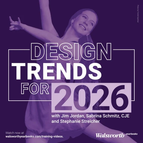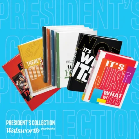
Celebrate the launch of the second round of our “2024 President’s Collection Series”! This special video series showcases national award-winning yearbooks created by programs that work with Walsworth Yearbooks. Each short video takes you behind the scenes of these standout yearbooks, highlighting the design elements and strategies that earned them national recognition. Along with each video, you’ll be able to access a Google Form assessment and a zip file of many of the spreads discussed, making it easy to incorporate into your classroom. Watch the videos with your staff and explore what makes these yearbooks exceptional.
Let’s begin with the next five books in the series:
Reflector, Lee’s Summit High School, Lee’s Summit, Missouri
The Lee’s Summit High School yearbook is a shining example of award-winning design and storytelling. The cover’s matte black finish with applied silk screen elements creates a visually striking and thematic introduction, hinting at the book’s “It’s Not What It Looks Like” theme.
Throughout the pages, the designers demonstrate a masterful command of layout, skillfully blending dominant photos, overlapping image clusters and well-crafted captions to bring the narrative to life. The consistent use of a cohesive design language, including a subtle tilt and skinny text columns, unifies the entire publication. From the table of contents to the personalized senior pages, every detail reflects the team’s dedication to journalistic excellence and their commitment to engaging their audience in creative and unexpected ways.
Ayrie, Liberty North High School, Liberty, Missouri
Liberty North’s publication did a tremendous job showcasing exceptional design and thoughtful theme development. The bold use of color blocking and area rugging on the cover immediately grabs attention, setting the tone for the book’s dynamic visual style. The team expertly balanced vibrant hues with clean typography, ensuring the design elements complement each other.
Throughout the book, they showcased their school’s unique personality, from the personalized theme elements to the engaging spreads highlighting students’ interests and fears. The senior section’s innovative approach to portraits further demonstrates the program’s commitment to innovative storytelling. With its cohesive theme, impactful visuals and dedication to capturing the Liberty North experience, this yearbook is a true standout.
Crag, Turner Ashby, Bridgewater, Virginia
The Crag staff made us wonder what was ours with their standout theme package. The split cover design, with four distinct versions, showcases the team’s thoughtful approach to personalization and thematic integration. The consistent use of modern serif fonts, italics and parallelogram graphics creates a cohesive visual identity that carries through the entire book.
The early development of the theme package, with its intriguing “Everybody has one, what’s yours?” phrase, demonstrates the staff’s commitment to establishing a strong conceptual foundation. Innovative layout techniques, such as the dramatic senior spread and the strategic use of yellow spot color, further elevate the yearbook’s design. Turner Ashby’s dedication to journalistic excellence and attention to detail have rightfully earned them recognition as a CSPA Crown and NSPA Pacemaker finalist.
Showcase, UPrep, Seattle, Washington
The UPrep yearbook executes award-winning qualities through its cohesive and innovative design. Jim and Sabrina praised the staff’s effective use of a unique, trendy font that adds personality without competing with other elements. The layered cover design, with ghosted images behind color blocks, creates depth and visual interest.
The consistent application of the theme, from the cover to the endsheets and title page, demonstrates a strong branding approach. Jim and Sabrina also highlighted the thoughtful representation of diverse students, the impactful use of headlines and captions, and the creative layout techniques used, such as photo cutouts and mod placement. Overall, the UPrep yearbook exemplifies the talent and dedication of the staff, guided by an experienced adviser, to produce an exceptional publication.
Oro, Cactus Canyon Junior High School, Apache Junction, Arizona
The Cactus Canyon Junior High yearbook made a splash in the middle school yearbook space with their award-winning design and storytelling. The staff expertly utilized creative techniques, such as reverse type bars, parallelograms, and layered text and photos to create a cohesive and visually engaging theme package. The cover design immediately draws the reader in with personalized photos and a dynamic layout.
Throughout the book, the team maintained consistency in their design elements while introducing fresh variations, keeping the content interesting and engaging. The inclusion of diverse student voices, including a spread in Spanish, showcased the staff’s commitment to representing their entire school community. From the thoughtful mug section to the personalized closing spreads, this yearbook exemplifies Cactus Canyon Junior High’s dedication to journalistic excellence.
Tune in next week to read out about the next group of schools to be featured, and be sure to follow along with the videos in our President’s Collection and watch with your staff.