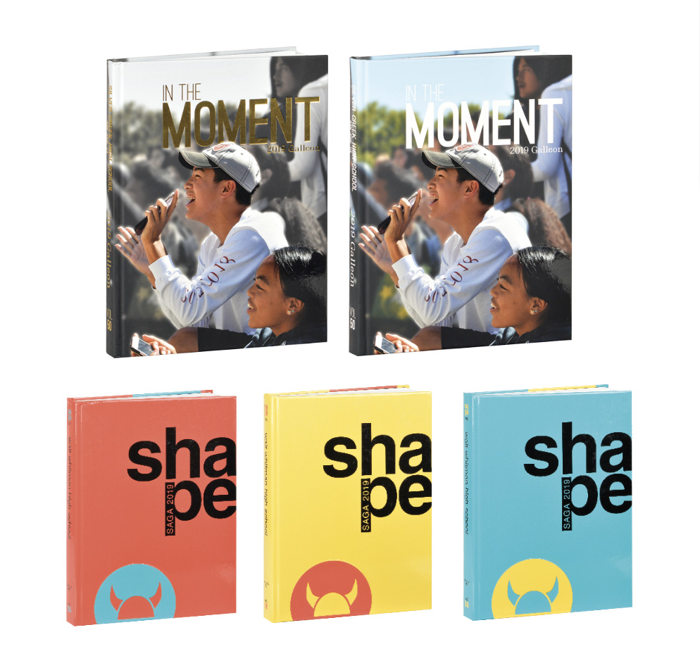
With your theme decided, it’s time to think about options that will make your book shine. From laser cut covers or endsheets to adding a gatefold inside, your options are virtually endless. Here are a few ways schools added a fab factor to their 2019 yearbooks. Now it’s your turn; let your imagination run wild! Split Covers Want to give …
You have a theme. You have even created or are working on a cover. You might have worked on theme-related pages that are traditionally found in every yearbook, such as the endsheets, title page, opening, closing and division spreads. Now it’s time to do the storytelling, right? But wait. What about the theme? What about the voice? There are all …
The book gets done and distributed and it’s instantly time to start thinking about next year. That was fast. It’s time to get the creative juices flowing and start gathering inspiration and contemplate what the story of 2020 at your school will be. Part One – Story Quest What story do you want to tell in 2020? This is where …
Everyone always wants to know what the current “trends” are for the upcoming yearbook year. What cool things are other schools doing that we should consider doing? Or even better, what did we do that has become a trend that everyone is going to be doing in 2019? At every workshop and every convention everyone wants to hear this session. …
For this issue of Idea File, I have collaborated with my good friend Becky Tate from Shawnee Mission North High School in Overland Park, Kansas. We decided there are two areas of design that everyone should pay attention to – deciding on and using fonts correctly, and creating pages/spreads that will visually help tell the story. Young designers are frequently …
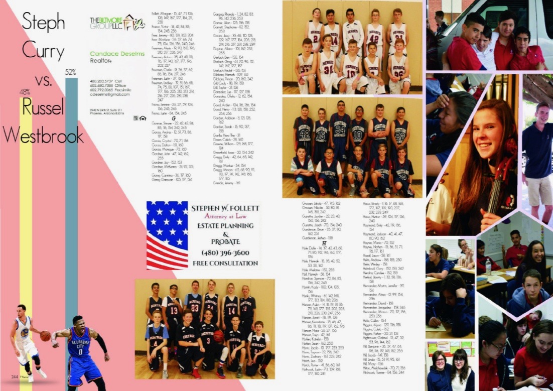
When you put so much time and energy into making the pages of your yearbook look beautiful, it’s easy to neglect the index, defaulting to a phonebook-style list of names. It still serves its purpose with that approach, but when the index is the most viewed part of your yearbook, doesn’t it deserve the same attention as the rest of …
This post is part of a series highlighting the employees and departments that provide Walsworth’s outstanding customer support. Our post about Computer Support can be found here and you can read about the company’s customer service representatives here. Walsworth strives to provide a positive yearbook experience to customers on all fronts. Creative Services is there to help with artistic endeavors. Schools …
HEY, why are you using font sizes that can be read from the space station? You and your students have a vision for the final project. Hopefully, in that vision, you dream of a classy, sophisticated book that your student body and community will love. You know your colors, you’ve planned great coverage, you’re getting the design in a spot-on …
Basic design knowledge is necessary to creating a strong yearbook. Teaching students how and why design is important is a worthwhile exercise. It may seem to take forever, but once students grasp the basics, they will soon be able to use those skills to create a sophisticated spread. You can start here with my Top 10 Design Rules for teaching …
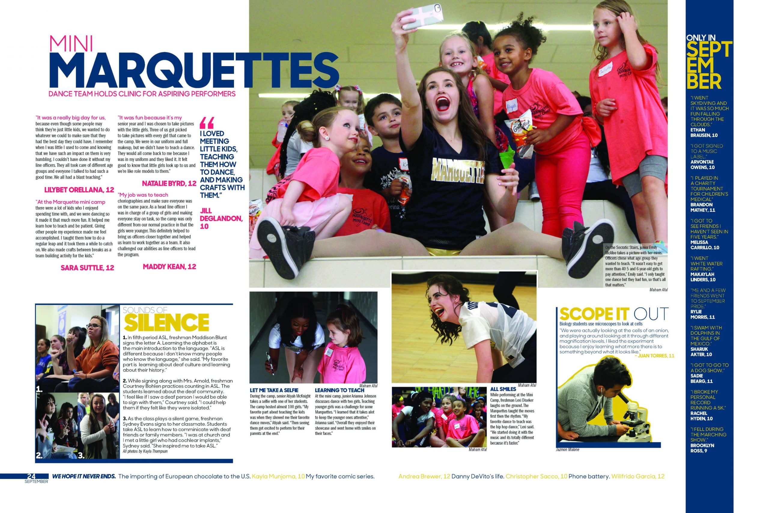
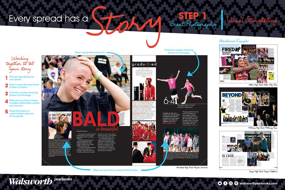
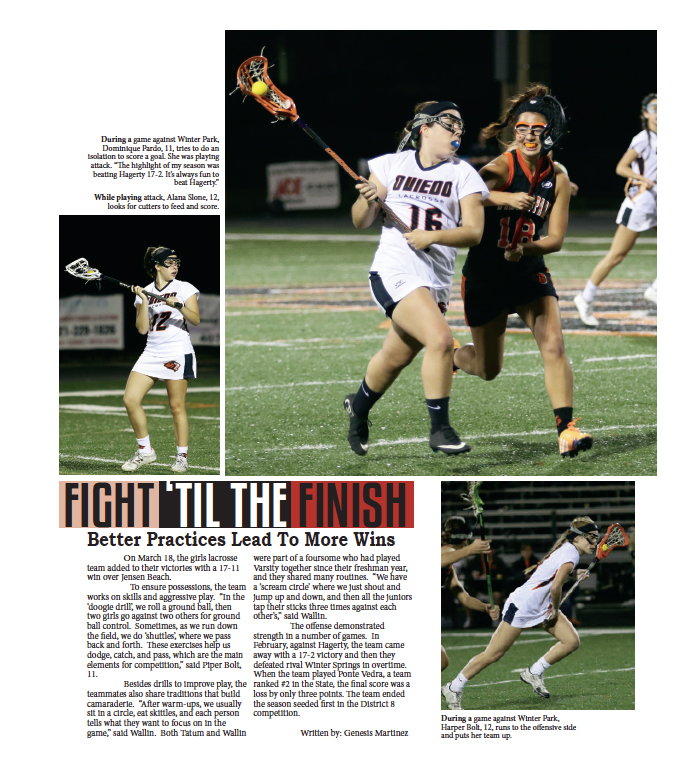
Two seconds is how long the average reader will look at a spread before turning the page. So it’s the designer’s job to try to capture those wandering eyes by using attractive yet planned design. Filling the page with more pictures will not help a reader stay on the spread. What will help is the use of several interesting entry …

