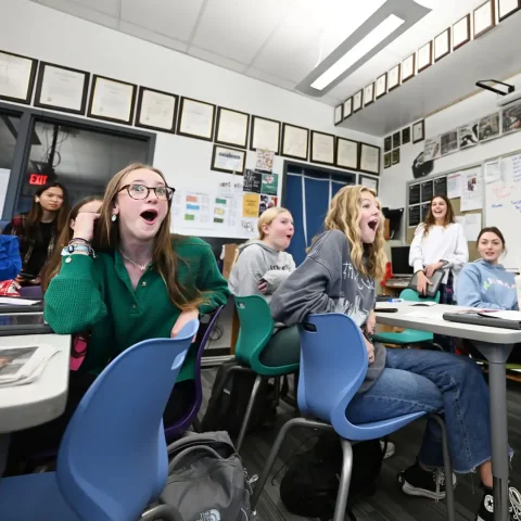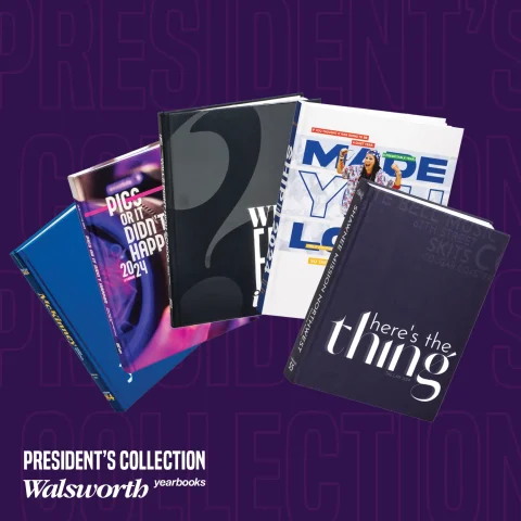
Take your staff training to the next level with the latest installment of our 2024 President’s Collection Series! This exclusive video series gives you a behind-the-scenes look at nationally recognized, award-winning yearbooks from top-tier programs that partner with Walsworth Yearbooks. Each video breaks down the standout design choices and storytelling strategies that earned these books national recognition.
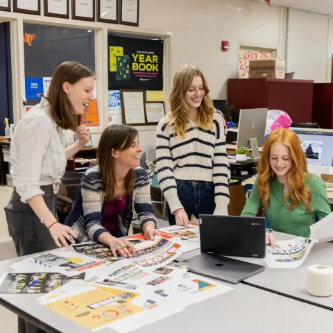
To make learning easy, every video comes with a Google Form assessment and a zip file of key spreads – giving you everything you need to bring these best practices into your classroom. Gather your staff, hit play and get inspired by the creativity and innovation in these exceptional yearbooks.
Here’s a look at the next five books in the series:
The Lion, McKinney High School, McKinney, Texas
The McKinney High School yearbook exemplifies journalistic excellence, earning a National Scholastic Press Association Pacemaker Finalist award through its sophisticated design, strategic storytelling and consistent visual communication. The publication demonstrates an innovative approach to yearbook creation that goes beyond traditional documentation.
By maintaining a strong photographic focus and developing a cohesive theme package, the yearbook captures the school’s culture and spirit. The staff’s ability to document campus life through creative design techniques, compelling typography and authentic student voices sets this publication apart as a premier example of high school journalism, continuing a legacy of excellence established by multiple award-winning advisers.
Le Flambeau, Notre Dame De Sion High School, Kansas City, Missouri
The Notre Dame De Sion yearbook features a design centered on geometric shapes and color blocking. The team created spreads with square and rectangular photo layouts, maintaining consistent margins and typography. Sections include summer highlights, group photos and senior portraits, each following a structured visual approach.
The book uses color pulls and thematic elements like “picture this” mods to add visual interest. The design breaks traditional yearbook rules by using uniform photo shapes and innovative page layouts, resulting in a modern, cohesive publication that reflects the school’s visual identity. From the front cover to the final page, the yearbook maintains a deliberate and thoughtful design strategy.
The Ship, Presque Isle High School, Presque Isle, Maine
“We Made You Look,” masterfully executes its theme through vibrant design and strategic visual storytelling. The cover and opening spreads feature dynamic color bars, transparent photos and purposeful type placement that immediately capture attention and set an energetic tone.
Throughout the book, the staff maintains this innovative approach by incorporating unique elements like a scanned summer bucket list, a potato harvest spread and a creative index featuring cultural trends. The consistent use of color, playful typography and engaging photography ensures that the theme feels fresh and cohesive, inviting readers to explore the school’s story in an unexpected and memorable way.
The Lair, Shawnee Mission Northwest High School, Shawnee, Kansas
The yearbook explores their school year through the lens of “Here’s the Thing,” a theme that invites readers into raw, unfiltered stories of student experiences. The design leverages typography and a circular word cloud motif to create visual interest, transforming traditional yearbook layouts into dynamic storytelling spaces that capture both triumphant and challenging moments.
From conversations between strangers to profiles of student models and basketball celebrations, the book embraces a narrative approach that goes beyond surface-level coverage. The staff crafted spreads that highlight diverse student experiences, using full-bleed photography, thoughtful copy and a consistent design language to create a cohesive exploration of what high school truly means.
The Tiger, Wills Point High School, Willis Point, Texas
This yearbook explores change through its “What Else is New?” theme, using a bold question mark graphic and dynamic typography to visually represent transformation. The design employs contrasting fonts and strategic color placement to highlight the narrative of shifting experiences.
Storytelling focuses on individual student perspectives, with spreads capturing personal transitions and campus trends. The book’s tone balances sarcasm and reflection, moving from questioning at the beginning to a resolute “it just is” conclusion. Modular design and creative coverage showcase the staff’s innovative approach to documenting the school year.
Tune in next week to read out about the next group of schools to be featured, and be sure to follow along with the videos in our President’s Collection and watch with your staff.