Once again, hosts Mike Taylor, CJE, and Jim Jordan turned it out with a yearbook webinar. Happy Headlines, Magnificent Mods: Eye-catching Design Elements in Your Yearbook focused on design. Couldn’t make it to our live webinar on Dec. 12? That’s OK – the recording is available on-demand at walsworthyearbooks.com/webinars.
Who should watch this webinar? Anyone who wants to draw readers into their yearbook spread with eye-catching headlines and interesting mods. Keep reading for an idea of what you’ll learn in this webinar.
Happy Headlines
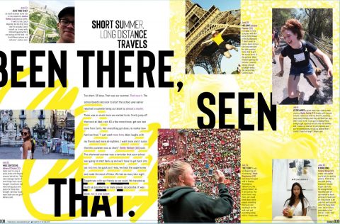 There is a huge difference in the use of a title and creating a dynamic headline to attract a reader to a spread. Taylor and Jordan explain to staffs how headlines, secondary headlines, use of type and design can be used to enhance their spreads.
More Than a Label
Don’t confuse a title with a strong headline. There is a difference. Do not confuse descriptors like “football,” “tennis,” “cheerleaders,” “band” or “academics” with headlines. These belong in the folio. A headline will incorporate a strong action verb, present tense and will relate to the photos and or story on the spread. There are rules and guidelines that will make writing headlines understandable for yearbook staff members. Jim and Mike explain those rules in detail and share dozens of fantastic examples.
Know the Basics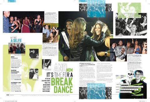
A dynamic headline will have:
- A main headline
- A subhead
- Dynamic typography
- Creative wordplay
Headlines have two parts, a primary headline and a secondary headline (also known as a subhead). Primary headlines are made up from a few dynamic, creative words that spark interest and accurately reflect the subject of the story. These are the first words the reader will connect with. Secondary headlines are one or two sentences that deliver specifics by including facts, figures and feelings. Subheads should make the reader want to find out more and read on. Don’t fall into the “students” trap! Your subheads should only occasionally start with the word “students.” If every subhead reads “Students enjoyed this” or “Students worked hard at that,” you need to do some rewrites.
It’s Lit(erary)
Creative word play makes for a fun and interesting headline. The hosts shared common literary devices that are used for yearbook headlines.
- Alliteration – the repetition of the same letter sound at the beginning of several words in a phrase or sentence. For example, “Like a Light” or “Tampa Bay Title Town.”
- Allusion – an expression designed to call something to mind without mentioning it explicitly. This is often an indirect reference to literature, music, art or pop culture. For example, “The Road Less Traveled” on a spread about hiking alludes to the Robert Frost poem.
- Puns – a play on words. Puns make a joke exploiting the different possible meanings of a word. This is a play on words that sound alike buy have different meanings. For example, “Fun is Bandatory” on a marching band spread plays on how “band” and the first syllable of “mandatory” sound alike.
- Rhyme – the correspondence of sound between words or the endings of words, especially when these are used at the ends of lines. Examples of rhyme in headlines include “Tie Dye Sky” or “TikTok: Hot or Not?”
Just My Type
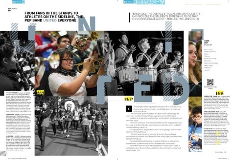 Type is everything! Choose your fonts with care. Effective headline design requires strategic thought to emphasize key content words. Use a wide range of sizes, weights and widths in your typography. Utilize hierarchy in your design. A wide range of type size communicates levels of importance. Be sure to make the most important words the biggest. Your primary headline should be at least 14 pts larger than any other text on the spread.
Focus on readability and tone when selecting your typography. Readers should focus on your words, not the font. Here are some common strategies you can use for your typography.
- Single-font strategy – one font family, with many variations, is used for all headlines and body copy throughout the book.
- Multiple-font strategy – a serf and a sans-serif family are teamed together for headlines in various combinations. Another option is to sue a single font teamed with an emphasis font.
Other Considerations
- Visual verbal connection – let the dominant photo inspire the words in your primary headline.
- Color coordination – echo a color from the dominant photo to highlight the key word or words in the primary headline.
- Capitalization – consider all-caps, small-caps or all-lower case and sentence-style type for impact and variety.
- Arrangement – placement of the headline components can vary while still maintaining consistency.
- Think action – headlines should be in subject > verb > direct object format. You can break this rule for effect at times, but keep in mind that prepositional phrases do not relay the action. Keep them brief, but use active verbs.
- Present Tense – a headline is what the story is about.
Magnificent Mods
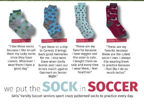 Mods – also known as sidebars, side coverage or side salads – are mini bites of coverage designed and packaged to tell a story. They are short, informative graphics that will enhance a story or spread. There are hundreds of ways to research, photograph, and design sidebars. Mods are a great way to increase your coverage and include more student voices. Bonus: they’re fun and easy to read!
Mods can feature student quotes, questionnaires, statistics, poll results, timelines, and more. Let your imagination run wild when thinking up ideas for mods.
In this webinar, Taylor and Jordan provided tons of creative ways to develop sidebars, mods and side salads for your 2022 yearbook.
Give it a Look
Happy Headlines, Magnificent Mods is available on-demand. You can fill out the form below to be taken directly to the recording. This webinar, plus other webinar recordings and information about upcoming events, is available at walsworthyearbooks.com/webinars.

