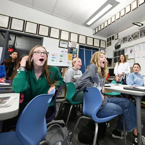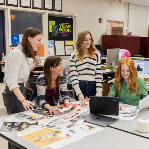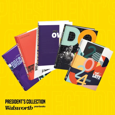
Level up your staff training with the fifth installment of our 2024 President’s Collection Series! This exclusive video series offers an inside look at nationally recognized, award-winning yearbooks created by top-tier programs that partner with Walsworth Yearbooks. Each video breaks down the design elements and storytelling techniques that earned these books national honors.
Watch the full, free videos and unlock even more valuable insights with the accompanying Google Form assessment and a zip file of key spreads. Plus, explore our showcase gallery for an in-depth look at each award-winning yearbook. Gather your staff, press play, and get inspired by the best in yearbook design!
Let’s dive into the next five books in the series:
The Torch, Athens Drive Magnet High School, Raleigh, North Carolina
The Athens Drive High School yearbook, The Torch, demonstrates strong design and journalism. The cover incorporates shapes, patterns and a theme phrase that reinforces the “As of Late” concept. Inside, the staff uses jump coverage, dominant photos and modular layouts to effectively tell stories. The opening spreads highlight new additions to the school, reinforcing the theme. Consistent use of color, typography and white space gives the book a cohesive look. The senior section includes personalized portraits, and the colophon features color swatches, showing the staff’s attention to detail. This award-winning publication showcases what it takes to be an award-winning yearbook.
The Hart, Bishop Miege High School, Roeland Park, Kansas
The Bishop Miege yearbook stands out for its strong design and well-executed theme. A bold color palette, striking typography and personal photography make the cover immediately engaging. Rounded corners, repeating patterns and the recurring “Do It” phrase create a unified look throughout. The staff planned the theme early on, building a solid foundation for the book’s design. Creative spreads, like the ABCs of Miege and the Kansas City feature, highlight the team’s attention to detail and storytelling. These design elements showcase Bishop Miege’s dedication to producing a high-quality, cohesive yearbook.
The Frontier, Chisholm Trail High School, Fort Worth, Texas
The Chisholm Trail yearbook delivers a fresh approach to design with a clear and cohesive theme. The cover features striking “We Own It” typography and a playful word jumble, setting the tone for the book’s type-driven style. Inside, the staff uses large cutouts, rotated headlines and a structured grid to create an engaging layout. The theme carries through consistently, from the purple color scheme to the poetic and well-executed theme copy. Creative elements like the lip sync contest title page and personalized trend spreads capture the school’s energy and personality. This award-winning yearbook reflects Chisholm Trail’s commitment to quality journalism and design.
Campus, Kiski Area High School, Vandergrift, Pennsylvania
The Kiski Area High School yearbook builds its design around the “Organized Khaos” theme. This concept comes through in the personalized cover with the school’s initials, dynamic photo blocking and varied typography. Storytelling elements like the art spread with student self-portraits and the sports spread’s “wormhole” narrative highlight the staff’s effort to capture school life. Design choices, including mirrored opening and closing spreads, create a strong visual structure. As an NSPA Pacemaker finalist, the Kiski Area yearbook demonstrates a clear theme and a creative approach to storytelling.
The Arena, Legacy High School, Mansfield, Texas
The Legacy High School yearbook incorporates school colors of red and black while also experimenting with new design ideas. The gatefold cover, which folds along diagonal lines, adds a unique structural element. Slanted design elements appear throughout the book, creating a consistent visual style. The theme is reinforced with “If” statements inspired by a Rudyard Kipling poem, woven seamlessly into the content. Contrast and balance play a key role, as seen in the cheerleader spread, where black and white backgrounds highlight the white uniforms. From creative storytelling in the football spread to historical details in the index, the yearbook reflects the staff’s dedication to strong journalism and design.
Tune in next week to read out about the next group of schools to be featured, and be sure to follow along with the videos in our President’s Collection and watch with your staff.