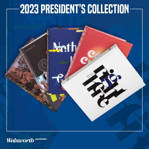
Unleash the power of creative inspiration by diving into our 2023 President’s Collection Video Series, which showcases the national award-winning yearbooks who choose to print with Walsworth Yearbooks. These videos let you witness award-winning secrets firsthand and come equipped with companion classroom resources. Elevate your staff’s skills by dissecting what sets these yearbooks apart. Let’s take a look at our first five books in this series:
Ledoian, Aledo High School, Aledo, Texas
Aledo High School’s award-winning yearbook showcased innovative design techniques that led to their recognition. They utilize a split cover, which allows students to choose between four options and thereby personalize their yearbook experience. Cohesive theme elements, like repeating fonts and graphics, tie all sections together visually from the creatively crafted cover. The theme packet was purposefully designed as one unit for a seamless flow. Unique senior pages capture personalities at the end, while modular portraits allow varied creative storytelling. These practices exemplify the Texas school and its dedication to journalistic excellence.
The Torch, Athens Drive High School, Raleigh, North Carolina
The Athens Drive yearbook staff meticulously designed every element of their theme package together to create a cohesive book recognized with double awards. The staff took great care to visually and verbally connect each component, from their attention-grabbing cover design, incorporating layered photos and typography, to their creative endsheets, featuring a mini table of contents. Within the book, they balance impactful feature spreads highlighting key events and individuals through bold imagery and quotes against traditional modular coverage of sports and clubs. Additionally, the staff thoughtfully group related stories onto connected multi-page spreads to tell complete narratives. Through their collaborative process and creative approach, this hardworking staff produced an award-winning yearbook that highlighted the experiences and personalities within their community.
Apollo, Colonial Forge High School, Stafford, Virginia
The Colonial Forge yearbook, Apollo, stands out as an exceptional publication with award-winning design elements. The book’s unique and cohesive theme carries throughout with elements from the cover and purposeful graphics. Key spreads, like the environmental page and homecoming spread, show creativity with photos and color usage. Unique features, like the Airpod case spread, encourage new ideas and push the envelope on what it means to capture historical information. Overall, the book is commendable for taking risks with fresh topics while maintaining a consistent brand showing staff dedication to outstanding journalistic design.
The Legend, El Dorado High School, El Paso, Texas
The El Dorado High School yearbook from El Paso, Texas, received recognition for its thoughtful bilingual design at both the Columbia Scholastic Press Association and National Scholastic Press Association. The clean, sophisticated book utilizes a warm color palette and retro serif font to represent both the English and Spanish-speaking student populations. Subtle graphics and limited photography allow the type and colors to shine. They generously incorporate white space through balanced, airy spreads focused on themes like social media and student art. This yearbook serves as an excellent example of designing an inclusive publication to honor a diverse student body.
Raider, Gulliver Preparatory Upper School, Miami, Florida
The Gulliver Prep yearbook achieved national recognition, winning both CSPA Crown and NSPA Pacemaker awards. The book stands out for its clean minimalist design that allows powerful photography and typography to shine. Designers meticulously crafted theme spreads using subtle slants and whitespace to guide readers’ eyes cohesively. Spreads like “Helping Out” break conventions creatively through off-margin modulars. Colors pull directly from photos on spreads like “Words in Color” to achieve visual-verbal unity. The title page and cover draw attention through impactful type-centric designs needing few additional elements. Careful gridwork ensures consistency throughout this award-winning publication.
Tune in next week to read out about the next group of schools to be featured, and be sure to follow along with the videos in our President’s Collection and watch with your staff.


