Yearbook design is what sets your book apart from all the others. It’s how you convey your school’s voice and personality to readers, but most importantly, design helps complete and deliver your book’s theme to your audience.
Just like the photography and written stories that appear in the yearbook, design is an integral and inseparable part of the storytelling journey. It’s a voyage through the creative process that shapes not only the visual appeal of your yearbook but also the emotional connection it forges with its readers.
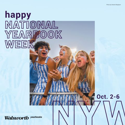
As we celebrate the last and final day of National Yearbook Week, let’s dive into understanding just how pivotal a role design plays in immortalizing the moments, experiences and memories that define your year.
What is Yearbook Design Really About?
Design helps communicate the story each spread is trying to tell. It arranges the chosen photos, typography and graphics with intentionality and purpose. Design isn’t haphazard; it follows a deliberate plan. When you begin to explore top-notch designs, you’ll see how these elements harmonize with each other to form a cohesive whole.
In our Yearbook Suite curriculum unit, “Understanding Why Design Matters,” author Mike Taylor, CJE, explains that “publication design is more than placing pictures on pages. It’s more than picking pretty fonts. It’s more than using green, ‘because it’s my favorite color.’ Good designers evolve and good design communicates. It draws the reader in, it enhances stories, it drives your well-chosen theme.”
When it comes to drawing inspiration for your yearbook design, the great news is that you have a world of possibilities at your fingertips – literally! We’ve compiled some of the best resources to help you start exploring and elevating your design game.
Finding Inspiration
Discovering and learning from great design in yearbook will allow you to open your mind to a wealth of new approaches you can take on your journey to enhanced designing.
To get started, we recommend looking at several of the featured examples and spread designs found in Walsworth’s Possibilities Vol. 9. Exceptional design can also be found in Walsworth’s online theme gallery at walsworthyearbooks.com/theme-gallery. Keep your eye out for examples of the following as you explore these resources:
- Creative use of typography
- Dynamic photography
- Innovative layout arrangements
- Effective color schemes
- Captions for all pictures
- Eye-catching graphics
Make note of which design examples pull you into the spread, establish harmony among stories, photos and mods, and breathe life into the yearbook’s narrative. These examples will serve as valuable guides and spark your own creative ideas as you get started.
Grids are another essential piece of the yearbook design puzzle. They provide structure, consistency and a sense of order to your spread layout. Utilizing grids correctly not only ensures a visually appealing design, but also streamlines the placement of content, making it easier for readers to navigate.
For more on grids, check out our new “Design Fundamentals: Using Grids in Yearbook 360 – Online Design” training video with Mike Taylor, CJE, Jim Jordan and Sabrina Schmitz, CJE, and learn about the secret weapon to making your layouts shine.
Take It from Here
Need more help? You’ve come to the right place! Check out the resources below to revolutionize design throughout your program.
As we mentioned above, once you start to recognize great design, those same elements will begin taking shape into your own yearbook. Our “Now Trending: Yearbook Trends for 2024” webinar breaks down 15 of this year’s hottest yearbook design trends to help you shake up the status quo in your classroom.
Visit Walsworth’s Design Showcase Gallery and prepare to be amazed while scrolling through some of the finest design work carried out each year by Walsworth Yearbooks schools.
Our Selecting Your Color Palette eBook will help you understand color choices, how to pair them and how to incorporate color palettes into your theme.
Browse the Caught Our Eye column in our latest edition of Idea File magazine for examples of spreads that made a lasting impression in 2023.
One of the best ways to elevate your design is to attend summer workshops, Adviser Academy and Walsworth Elite Weekends. If you didn’t make it this year, talk to your staff and school administration about attending one (or all) next year. Our schools come out with detailed plans for their yearbook design after consulting with yearbook experts. In fact, 85% of our national award-winning schools attended an Elite Weekend – really, it’s that effective!
Don’t forget to follow us on Instagram and Facebook for National Yearbook Week updates, yearbook tips and tricks and more. We love giving shout-outs to schools we see marketing successfully!
What can we do for you? Go to walsworthyearbooks.com/resources for more ideas and get inspired.
Want more design help? Just ask us – we’d love to help! Email us at marketingyearbooks@walsworth.com.


