When you put so much time and energy into making the pages of your yearbook look beautiful, it’s easy to neglect the index, defaulting to a phonebook-style list of names. It still serves its purpose with that approach, but when the index is the most viewed part of your yearbook, doesn’t it deserve the same attention as the rest of your masterpiece?
Plus, the index is a great opportunity to further the book’s theme and expand your coverage. From a simple design element or touch of color to treating it as its own full-on section, here are some ways to spice up your index:
Continue theme graphics and colors
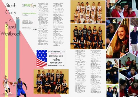
Adding elements from your yearbook theme into your index (i.e. font, background, clipart, graphics, etc.) not only livens up what could be text-heavy black and white pages, but it helps continue the “flow” of the theme.
Example: Heritage Academy’s 2017 The Hero staff from Mesa, Arizona, uses a colorful geometric pattern throughout the book and the index is no exception. It leverages the same design elements in photo collages and sidebars and still manages to use white space against the busy index copy. Incorporating candids and sidebars extended student coverage and gave the pages a unique look.
Enhance letter titles in the same manner
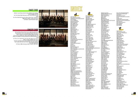
A simpler, more no-frills approach? Just give each title letter some love. This helps separate blocks of text and makes students’ names easier to find—and it also provides a subtle way to continue your theme with specific fonts and colors.
Example: The 2017 Mosaic staff from Monarch High School in Louisville, Colorado, simply dressed up each title letter in the same cursive font seen on its cover and in headlines throughout the book, using the same design elements (the horizontal lines) and colors.
Intersperse club and group photos
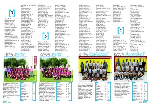
An easy way to break up the monotony of text in the index, and to save space in the rest of the book, is to include group photos from extracurricular organizations. And you can still get creative with the page layout, tying in theme design elements.
Example: The 2017 staff at Seminole Middle School in Plantation, Florida, carries the same font and colors used throughout the book into the index pages, breaking up the letter titles and identifying the clubs or teams in each picture. Listing the names of the individuals in each group photo and noting teams’ schedules is an easy way to include more students and athletics records from that year.
Use students for alphabetical dividers
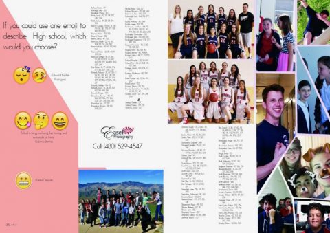
Include students to mark the beginning of each title letter. It allows you to not only enhance your alphabetical dividers, but it creates an opportunity for more student incorporation, be it just a photo, quote or both.
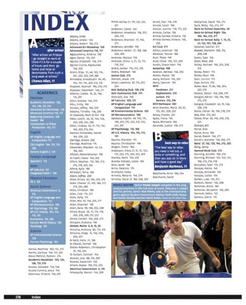
Example: The 2017 Decamhian staff at Del Campo High School in Fair Oaks, California, featured students based on last name and prompted their quotes with a topic/question from the same letter (i.e. “E – embarrassing moment,” “G – guilty pleasure”). They also used additional photos throughout to extend student life coverage.
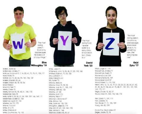
Example: The 2017 Shorelines staff at First Flight High School in Kill Devil, North Carolina, took a similar approach as Del Campo, but featured additional pictures alongside quotes. They carried on their “Dare to be…” theme by titling the index with “Dare to be… found” and by prompting the students featured to share the most daring thing they have ever done, the most daring food they have eaten, etc.
Run current events throughout the pages
Tying in actual content to the index draws readers into the pages that much more, and including news from that time period will be fun to look back on years later. With current events and news, you can get creative from a design and coverage standpoint, doing a full timeline or including just a few snippets in modules. You can organize chronologically, or play to the index and cover topics alphabetically.
Example: The 2017 Legend staff at Boone High School in Orlando, Florida, fully combines the two, titling the section “Index and Year in Review.” They run a nice timeline that spans the school year across the bottom of each page. And to the previous point, they use student headshots and quotes that play to their theme to breakup each alphabetical group of names.

Add current data, school-specific trends and other relevant milestones
Include facts and figures that define the year (fashion trends, movies, gas prices, professional sports moments, pop culture, music and video downloads, music and movie awards, etc.) that graduates can compare in 10 or 20 years. You can also archive the classes’ statistics and school’s information (top 10 academic standing in each class, number of students in each class, school demographics, scholarship award winners, total scholarships awarded, etc.).
Current data, trends or other student life stories and photos that didn’t find a home anywhere else in the book can work well in the index with a little thoughtful design.
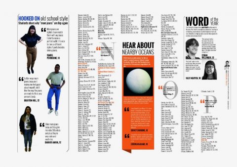
Example: Haltom High School’s 2017 Buffalo staff from Haltom City, Texas, makes the most of their index pages by including student quotes for the alphabetical dividers, but also on every sidebar item and even the page folios. From “mom jeans” to the Women’s March, they feature students’ opinions on a wide variety of fashion trends, sporting events and significant news moments from that year.
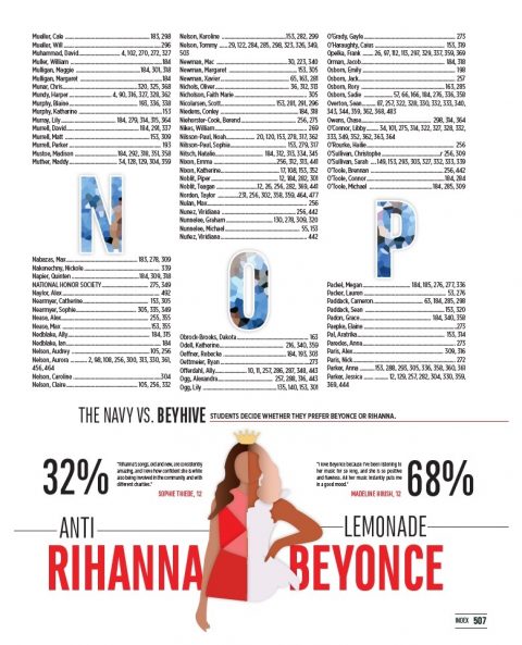
Example: The 2017 Hauberk staff at Shawnee Mission East High School in Prairie Village, Kansas, polled students on preferred music albums, lunch carriers, sneaker choices, restaurants and more to localize current trends and popular culture moments. They also use a section divider to open the index, keeping the pages in line with the theme and overall book layout.
While the index is a reference tool for your yearbook, keep in mind how much it will be viewed. Students flip through the book, sure, but they study the index to find the pages in which they and their peers are featured. So make the most of it! Make it fun. Assign a staff member to the index and try out any of the ideas listed above.

