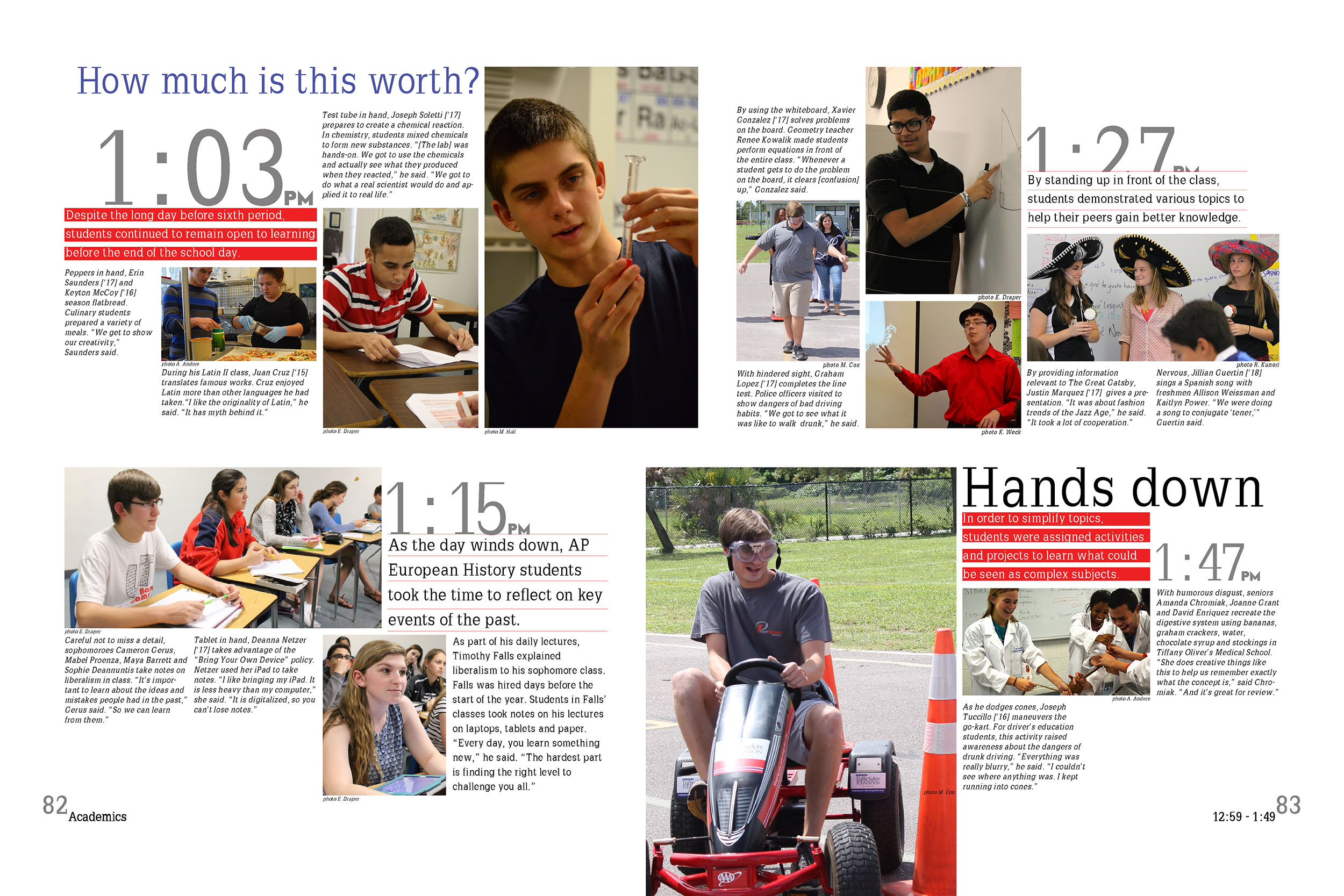
“Suzy, you are going to be the academics editor of the 2018 yearbook.” These words strike pride, excitement and dread into academics editors across the country. Why? Let’s explore that for a few minutes. Yes, you have a great responsibility. You are in charge of a portion of the book. Yes, a portion that could be the least-read pages within …
HEY, why are you using font sizes that can be read from the space station? You and your students have a vision for the final project. Hopefully, in that vision, you dream of a classy, sophisticated book that your student body and community will love. You know your colors, you’ve planned great coverage, you’re getting the design in a spot-on …
Basic design knowledge is necessary to creating a strong yearbook. Teaching students how and why design is important is a worthwhile exercise. It may seem to take forever, but once students grasp the basics, they will soon be able to use those skills to create a sophisticated spread. You can start here with my Top 10 Design Rules for teaching …
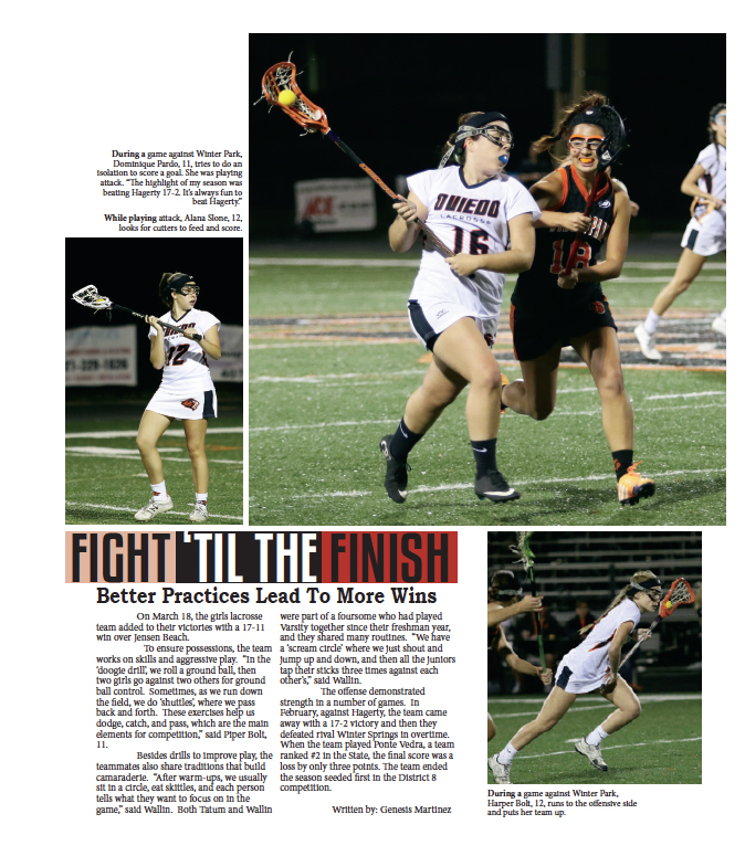
Two seconds is how long the average reader will look at a spread before turning the page. So it’s the designer’s job to try to capture those wandering eyes by using attractive yet planned design. Filling the page with more pictures will not help a reader stay on the spread. What will help is the use of several interesting entry …


