Your yearbook theme serves as the soul of your publication – a unifying thread that weaves the stories, memories and faces of the school year together. Yearbook advisers guiding students through this crucial process need a blend of creativity, collaboration and strategic thinking. The latest Walsworth Yearbooks Timely Tips lesson plan helps you and your staff develop a theme that …
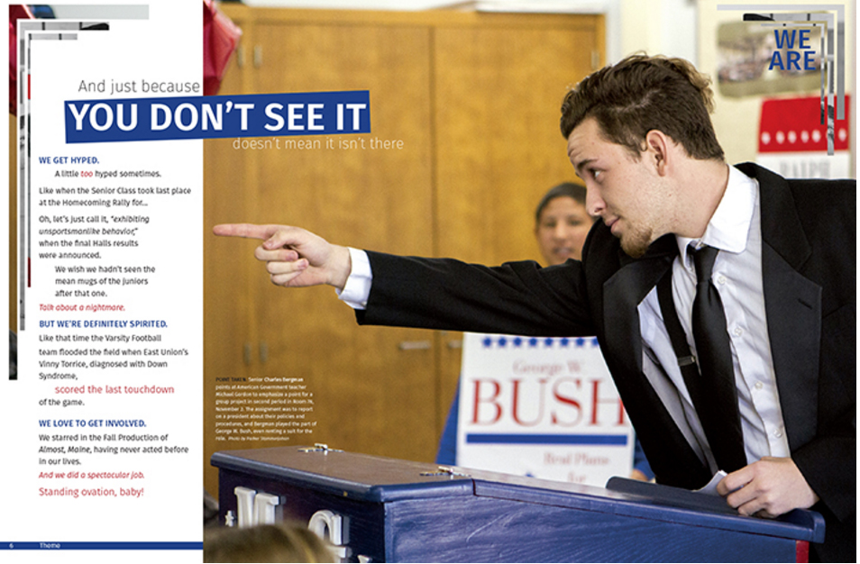
Strong theme copy helps introduce your unifying concept to your readers. Learn some tips and tricks for creating the optimal copy.
With the last deadline met and yearbooks not set to ship for another two months, it was time for the staff to think of next year’s theme. But we were not going to simply brainstorm it as a class; each of them was to develop a theme and sell it to the rest of us. That’s where this theme project came in…
Developing a theme idea throughout the yearbook not only helps to unify the book, but also adds a special dimension of involvement for readers. In the late 90s, there are many theme directions you can pursue.
If a theme is going to have a wide range of appeal, it should evolve from brainstorming by the entire yearbook staff. Follow the enclosed guidelines.
Once the theme is picked, the next decision involves presentation of the theme. How much theme is enough? The theme does not need to be spread across every page like peanut butter on a slice of bread. Like peanut butter, too much theme in too little space can gag a person.


