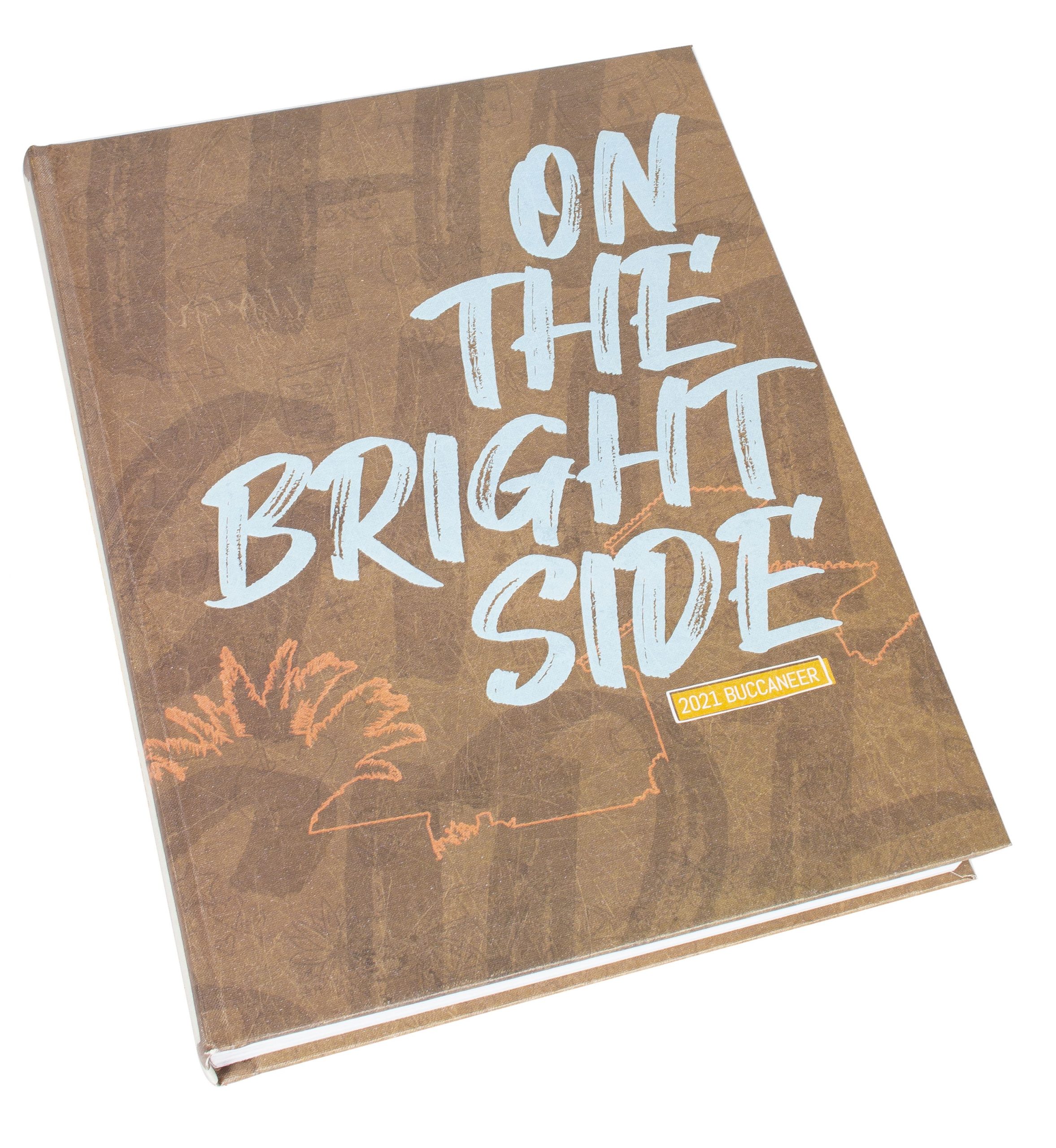
We see yearbooks that come in all varieties. The yearbook cover has the biggest impact on your book because let’s face it, people always judge a yearbook by its cover. Follow this checklist to make sure your yearbook cover is one for the books. Readable and Relatable Make sure your cover is readable and relatable and avoid too many graphics. …
In journalism class and on the yearbook staff, cover ethics first.
While understanding law – copyright, libel, invasion of privacy, obscenity, business issues, students’ rights – is important, good ethics help curb abuse of rules and the law and guide staff behavior toward noble goals. Ethics are the key in balancing student rights with responsibilities and respect.
Once the theme is picked, the next decision involves presentation of the theme. How much theme is enough? The theme does not need to be spread across every page like peanut butter on a slice of bread. Like peanut butter, too much theme in too little space can gag a person.
Your staff has successfully created a theme, and now they must interpret it on the cover for everyone to see. Luckily, help is available for advisers and staff to get their cover finalized and into production.
The agenda at a summer yearbook workshop usually allows time for fun and games. Playing “beat the clock” with the cover designer, however, should not be one of them.


