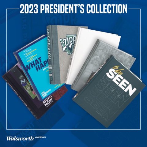
Let’s continue our journey of creative inspiration by diving further into our 2023 President’s Collection Video Series, which showcases the national award-winning yearbooks who choose to print with Walsworth Yearbooks. These videos let you witness award-winning secrets firsthand and come equipped with companion classroom resources. Elevate your staff’s skills by dissecting what sets these yearbooks apart. Let’s take a look at our next six books in this series:
Chisholm Trail High School, Fort Worth, Texas
This book is highly effective in its design and execution of theme. It immediately catches readers’ attention through a bold, visually striking cover utilizing contrasting colors and type. The students then carefully localized the “Right Here Right Now” theme throughout the book in layouts, photos and graphic elements.
The spreads showcase student leaders and activities beautifully through strong photography and clean, balanced modular designs. Subtle incorporation of the halftone effect and color palette ties all elements together cohesively. Overall, the yearbook tells the school’s story in a very polished, professionally designed package.
Dreyfoos School of the Arts, West Palm Beach, Florida
Dreyfoos did not disappoint this year, with its strong, cohesive theme incorporation and creative design. “What Happens Along the Way” is seamlessly woven through their theme package, gut spreads and showstoppers. Their careful use of bold color palettes and type unify each spread while carefully showcasing the diverse talents of an arts-focused school. Overall, it tells a unique story through daring design choices and mastery of visual storytelling that truly captures the heart and experiences of the school throughout the year.
Glacier Peak High School, Snohomish, Washington
This yearbook is praised for its exemplary design that truly captures the personality and spirit of the school through its theme. By centering the theme around representing the local Pacific Northwest community, the book utilizes nature-inspired colors, fonts and imagery that seamlessly evoke the region. Photographs throughout reflect the stunning natural scenery surrounding the school.
The cohesive design from the clever logo-featuring cover to catalog-style interior spreads establishes a strong foundation while still allowing for customization. The book’s perfect placement of design elements and ability to tell visual stories through its layouts makes this an award winner. Its theme is celebrated as an outstanding representation of the school’s identity and locale.
Hill Country Christian School, Austin, Texas
Hill Country’s yearbook utilizes a clean, minimalist design approach to let the content shine through. The theme “It’s the little things that count” is reinforced through the tightly packaged multi-colored theme phrase on the white cover. Though K-12, the book thoughtfully mixes age groups and captures all students in their school. Its design stands out through the consistent emphasis on small details over complicated graphics. The theme is reinforced throughout through focused attention to even the smallest elements that capture the student experience.
Lee’s Summit High School, Lee’s Summit, Missouri
This yearbook is a deserving award winner due to its strong, cohesive design aesthetic. The impactful theme, “It’s Time to Be Us” is carried throughout the book through thoughtful design choices. Feature spreads tell impactful stories through intentional photo selections and layout. Consistent elements like offset photos tied to a grid create visual interest while maintaining cleanliness. Pull colors and white space group elements consistently. The book feels modern, polished, and well-executed – a testament to the vision and skills of the editorial team. The yearbook’s subtle yet effective design makes it stand out.
Paetow High School, Katy, Texas
This publication demonstrates exceptional design choices that truly elevate the narrative. The theme of “Seen And Unseen” is masterfully portrayed through the use of a removable dust jacket and a carefully crafted theme package. Color coding and interaction of photos with type seamlessly guide the reader through each section and thoughtful repetition of design elements, from the endsheets to divider pages, ensures cohesion.
Overall, the book showcases how planning and visual storytelling can bring a theme to life through innovative layouts. The careful execution of these design elements is what makes this yearbook stand out.
Tune in next week to read out about the next group of schools to be featured, and be sure to follow along with the videos in our President’s Collection and watch with your staff.


