HEY, why are you using font sizes that can be read from the space station?
You and your students have a vision for the final project. Hopefully, in that vision, you dream of a classy, sophisticated book that your student body and community will love.
You know your colors, you’ve planned great coverage, you’re getting the design in a spot-on condition, and now you must decide on a font and its size.
Typically, yearbook staffs like to place all theme copy in an Enormous, GIGANTIC, HUMONGOUS type size to introduce the theme. This Dr. Suessian style begins on the endsheets with a 76-point section/spin off/page number list. After all, everyone needs to see our table of contents, even from across the room.
Our large font next travels to title page/page one, where we see the school info so large that it can be read from the neighboring school district. From there it moves ever so largely to the opening, division pages, quote boxes and finally closing in the billboard-of-the-month style.
STOP!
Most of your readers have strong eyesight. Even when you, the class of 2017, is 40, 50 or 90, you will have vision-correcting devices, i.e., glasses/contacts/LASEK. No need in taking up entire spreads with the HUMONGOUS, gargantuan, loud type size.
Yes, I’m being obnoxious in my writing. I’m not trying to be a jerk. I’m trying to convey how this over-the-top type size looks in your very well planned, well thought out and hopefully sophisticated yearbook. It just does not work.
Let me help you decide on your font sizes:
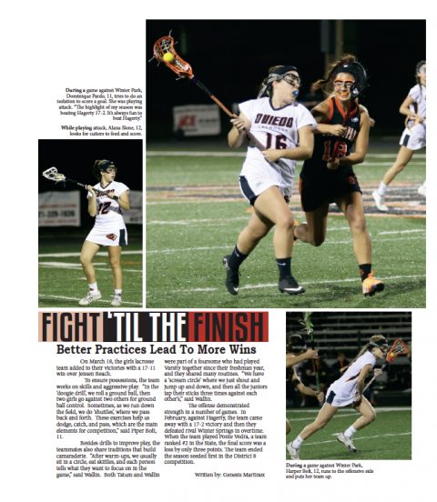
If using a standard serif font, such as Times Roman or Palatino, a typical yearbook tries to set the body copy in 12 points. This is a great size… for a research paper.
- Aim your traditional body copy font choices to a smaller size, such as nine- or 10-point.
- This will give you that all-out sophisticated style.
When using a sans serif font, such as Myriad Pro, Futura or Optima, you may want to go a bit smaller in your body copy sizes.
- The reason for this is because sans serif fonts print a bit larger.
- Eight- or nine-point body copy is very readable and offers an air of sophistication.
For your captions, simply go down one point size from the body copy.
When choosing your font, and picking sizes, follow these rules:
- Make a conscious choice.
- Use filler text to see how it looks.
- Aim for ragged right.
- Avoid forced justified.
- Open the leading, especially when using a background or reverse/white type.
Finally, think of type as the yearbook’s voice:
“To deal with type is much the same as to control one’s voice: [think of] selecting typefaces as voice quality; having a relationship with type in size, amount and degrees as vocal tone…. Typographic design is visible as well as audible.” – Hoon Kim, Why Not Smile


