The Look, The Story, The Words, The Images
Everyone always wants to know what the current “trends” are for the upcoming yearbook year. What cool things are other schools doing that we should consider doing? Or even better, what did we do that has become a trend that everyone is going to be doing in 2019?
At every workshop and every convention everyone wants to hear this session.
But somehow we have it all backwards.
We should first be asking the questions and making observations about what FOUNDATIONAL ELEMENTS can be found in EVERY book that is being recognized as a top-level yearbook.
What are the specific elements that make them great? So instead of thinking first of trends, let’s identify the specific things that can be found in these books that set them apart and make them amazing.
Some of what I am talking about are specific elements they have. But I am also talking about things that these books do as well.
Do you want your yearbook to be great as your yearbook program grows and matures? Consider how many of these elements your book has and which ones you want to improve on for 2019.
Think of these elements in four categories – The Look (design), The Story (coverage), The Words (writing), The Images (photos). Each one of these topics could be expanded and covered in greater depth, but here is an overview.
The Look
- Negative Space
Effectively utilize white space/negative space in every design.
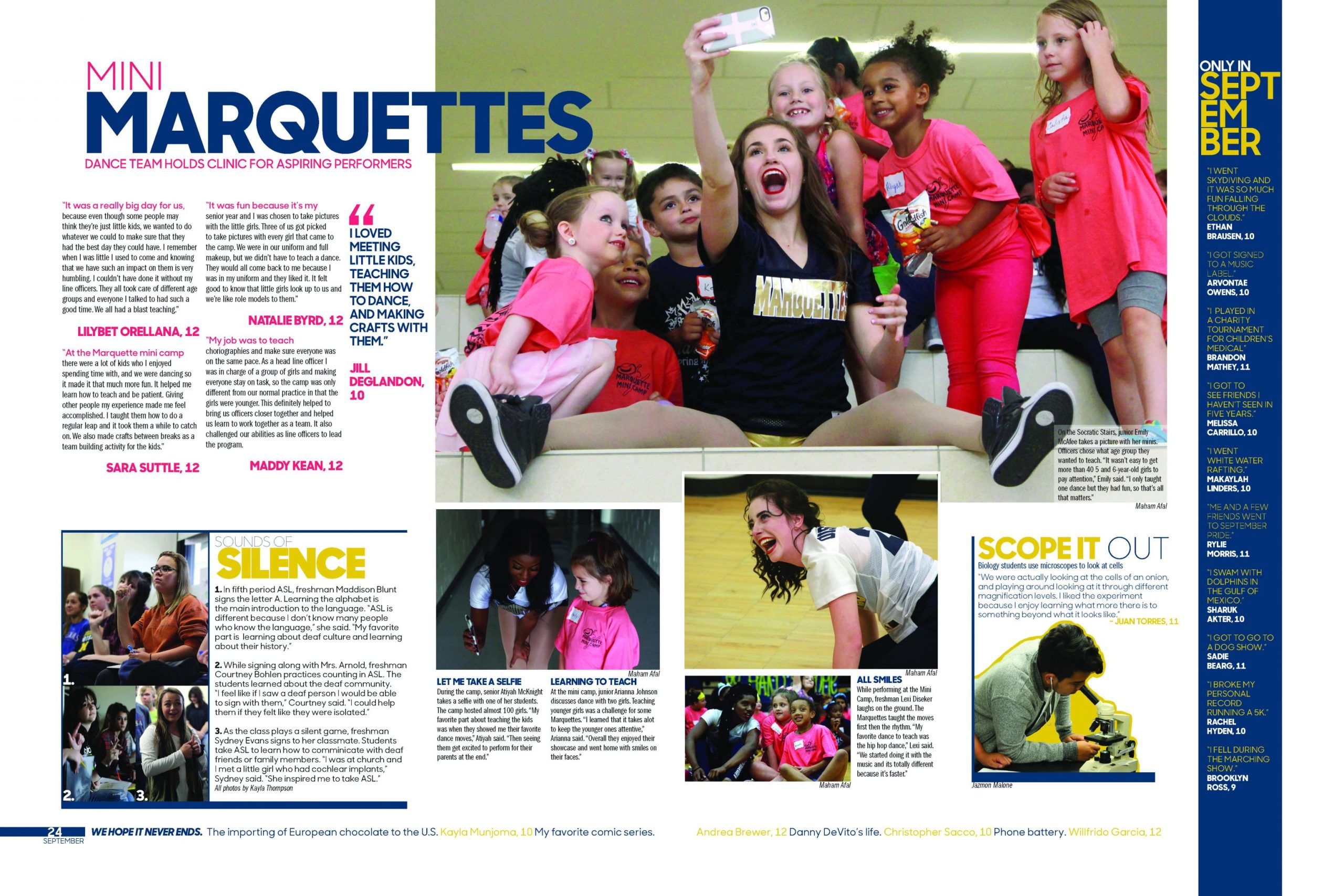
One of the hallmarks of a great book in the past 20 years is that it uses negative or white space effectively. The page has room for elements to breathe. It is not overcrowded with no clear reader entry points. The negative space is used to connect like items on the page, separate others to emphasize the content, and guide the reader around the page. The result is that it increases the readability of the page to enhance the story that is being told. It helps avoid the dreaded visual vomit (vv) of some pages that try to stack too many elements in too little space. Because it’s so difficult to wade through, MORE is definitely LESS. Are you thoughtfully using negative space?
- Structured for Storytelling
Structure each spread to help tell the story you want to tell.
As you determine the best way to tell the story, design using different ways to tell the story. Think mods. Think long story. Think alternate forms of coverage. Some stories may need a long-form approach, others may best be told in a first-person account. A chart or infographic may also help deepen the story you are trying to tell. Have you purposefully organized the spread content on each page to maximize the story?
- Dominance
As it was in the beginning, is now and ever shall be: ALL layouts MUST have a DOMINANT element!
The purpose of having a dominant element is to provide a center of visual interest to draw the reader in. It’s the focal point of the spread. Most frequently, it will be an outstanding photo around twice as large as any other on the page. If you don’t have a great dominant, keep looking, keep shooting until you get one. Does every spread have a dominant element?
- Type matters
Never settle for mediocre, outdated type.
Take time to find the fonts that fit the personality of your theme and the year. There are so many great fonts out there (including thousands of free ones). Take the time to build your design look around a font you love. Be careful never to mix too many fonts – it could lead to a design disaster or worse, vv (visual vomit). Have you carefully thought through the type you are using and do you love it?
- WOW Factor
Avoid too many spreads that look the same.
Part of creating reader interest along with visual variety in your book is including spreads that WOW! By the nature of how you must cover the year, some spreads will be more dense and info-based while a number should have the WOW factor. You will know one when you see one! How many spreads in your book have the WOW factor?
- Visual Variety
Vary the look of the spreads within a section. Avoid visual monotony.
Mix up the ways you tell the story of your year from spread to spreads. Some spreads may be more dense while others will have more negative space. Some spreads will cover many topics; others may cover just one. Avoid using a template that will make too many spreads look the same. Does your book have visual variety?
The Story
- People Focus
Your coverage and photos should focus on people.
As Bruce Watterson says, we should “scratch the surface and find people.” Telling the story of the year through the people at your school is your prime directive. Choose to tell the story of people over timelines, teams or events. How many times have you covered each student in your school? Two times is the minimum, but your goal should be more. Does your coverage focus on people?
- Find the Best Way to Tell the Story
The stories of your year can be told in so many different ways. Choose the best one for the story you are telling.
In some situations, a long-form story may be the best approach. Other times a story may only require a short piece. These short bites help you to expand your coverage to more people. Avoid monotony; mix it up. As you plan your coverage, make conscious choices about which method is best. Are you telling the story of the year in a variety of ways?
- Bite-sized Chunks
Use bite-sized chunks to tell the story.
The days of one long 500+ word story are over. Break up your coverage into short, readable pieces. Are you including a wide array of small, focused bits of copy?
- Alternative Methods
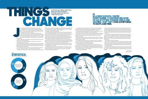
The editors of the 2018 Lion at McKinney High School in McKinney, Texas, thought it was important to shed light on how women are treated in society and at their school.
Think beyond the L-Q-T-Q method of telling the story.
There are so many possibilities – first person accounts, infographics, Q & A, pro/con, he said/she said – and many more. Include as many as you can. How many different methods did you use to tell the story?
- Story First. Photos Second.
Think about your story first.
Too often we start with the photos first and then build our storytelling around them. What we should be doing is thinking about the story first and then find or take the photos for that story.
If your photos are terrible or if you can’t get the RIGHT photo, you may need to rethink the angle of your story. Are you thinking story first, and then fitting your photo coverage to that story?
- Equity
Are you covering what the students are involved in?
Think about the number of kids who participate in certain things and try to give commensurate coverage. For example, if there are six kids on the golf team and 600 in marching band, you might want to cover the band more than once. Are you providing equitable coverage for the number of students involved?
- Localize the National Conversation
Extend your coverage into the local, national and global community.
This places the book in the larger context of the year, but make sure as you localize, nationalize and globalize the coverage that you connect it and make it relatable to your school community.
You can cover the Super Bowl, but unless your school is in Philly, you probably don’t need a spread for it. Was your school affected by any of the natural disasters like Hurricane Harvey or Irma? Cover it. Did students see the 2017 eclipse? Cover it. Did your students walk out in support of ending violence in schools? Cover it. Are you localizing local, national and global coverage?
The Words
- Focus on the Person
Focus on people in every story.
In every story in the book, dig deep to find the story of the people. Think “people over events” as the heart of every story. This kind of focus can only happen if you are committed to doing detailed in-depth interviews. Be sure you are willing to put the time in to do this right. Do your stories focus on people over summarizing events?
- Interviewing
Great journalists are great interviewers.
Start with great questions. Plan enough time. Be flexible. Be accurate. Are you always working to get that perfect interview? Are you practicing to get better at it? Is your staff expert at interviewing?
- Quote-driven
Great stories have great quotes.
Great quotes come from great face-to-face interviews. Accuracy is key; get their words exactly as they said them. Always. Never go up to anyone and say “Give me a quote.” You have to work hard to go deeper than “football is fun.” How good are the quotes in your stories?
-
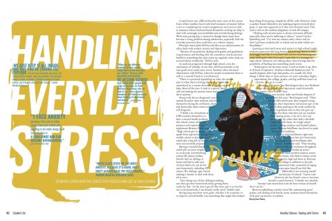
University High School in Orange City, Florida, tackled the topic of stress in a story reported in depth. Show the Why and the How
Go deeper in your storytelling.
Too often our stories settle for just the WHO, the WHAT and the WHERE. Develop questions for your interview that get to the WHY and the HOW of a story.
“Why did this happen?”
“How did the team put together the game- winning drive?”
“How did coming to CSPA change how you felt about creating a yearbook?”
Are you including the WHY and the HOW of the story?
- Telling the Best Story
There are many angles to a story, to a season, to an event, to a year. What is the story that needs to be told? Great writers dig deep to find the best story. Don’t settle for the easy, general one. You’ll know it’s the “right” one because it will be the most compelling and interesting. Are you finding and telling the best stories that need to be told?
The Images
- Storytelling Photos
The best photos tell a clear story.
Capture a moment in that time that is unrepeatable. Storytelling photos are easy to caption because they tell a clear story. How many photos capture a single moment that tells a rich, unrepeatable story?
- Know Photo Composition
Consider all the elements of great composition as you take and choose photos for each story.
- Rule of thirds
- Leading Lines
- Balance
- Symmetry and patterns
- Viewpoint / vary your angles
- Framing
- Depth of field
- Variation – close-ups, doubles, groups
Are your photos well-composed?
- Crop Effectively
Crop to enhance the content and the impact of the story being told.
Think: can this be cropped into an effective storytelling photo? View the photo with a cropper’s eye. What parts of the photo tell the story? How can it be most effectively cropped to tell the story? Some photos may appear to be weak, but when cropped effectively, they can become magical. The goal though is for each photo to be cropped perfectly IN THE CAMERA. Are your photos cropped well to enhance the story they tell?
- Show Action/Reaction
If you have action/reaction in one photo, it should tell a story.
Look to identify the action and the accompanying reaction in the photo. What story is it telling? Do you have photos that show action and the reaction?
- Capture people’s faces. Get close. Crop close. Show the faces.
Get more faces into your book.
Capture the emotion of the faces. Crop to focus on the face. Action/reaction will always be tied to the face. How many great face shots does your book have?


