I was shocked. I was horrified.
I worked with several schools this past spring who had not even started their opening pages or theme copy, even though it was the beginning of March!
What’s up with that?
You may have a deadline structure that allows for this, but it’s not the best approach for introducing the story you are trying to tell and the look you want your entire book to have.
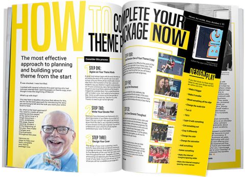
So, what is the best approach? You need to create all your opening section pages at the same time in a single document – cover, endsheets, title page, theme opening, dividers –
at the beginning of the year, then make changes and improvements throughout the year.
Here are six steps to help your team complete your theme package now.
Consider this process:
STEP ONE: Agree on Your Theme Words
A great book always begins with the words. Remember, you are telling the story of this specific year at your specific school, and your theme phrase should create a mood and vibe that is the foundation of that story. Listen to what students say, pay attention to specific words and phrases on TV and commercials, take a field trip to Barnes & Noble or get on your local library website and flip through the magazines available there. Find a current theme phrase with a modern voice. Don’t settle for the first phrase you like. Come up with several and let them percolate. As Sabrina Schmitz would say, “Date them for a while. There’s no need to get married right away!”
STEP TWO: Write Your Elevator Pitch
Once you have discovered your theme words, write a short description of your theme, why you picked it and how it fits your school in this specific year. Writing this down from the start is very important as it reminds you of your process as the year progresses. If you work with a Walsworth cover artist, this will also help them understand your vision for the book.
STEP THREE: Design Your Cover
The design of your cover is everything. It sets the tone for your entire book and elements that drive your coverage and design. Great yearbooks introduce three to five elements on the cover that help create a cohesive look throughout the book. Typography, colors, layering, embossing and debossing are a few ways to bring out the cover of your book. As you work with your rep, have them show you all that is available as your budget allows.
STEP FOUR: Draft Version One of Your Theme Copy
This may seem premature or too difficult at this point of the year, but write a first rough draft of your theme copy. Find your voice and begin gathering examples that illustrate your words’ story. It won’t be perfect, but you will have a starting point for revisions as the year progresses.
STEP FIVE: Set Up One Document
This document includes the cover, endsheets, title page, opening spreads and the first divider. At this point, determine how many spreads you will need and how many spreads you can afford to introduce the story of your theme.
STEP SIX: Carry Cover Elements Throughout
Once you design the cover and decide on fonts, colors and other elements, move them onto the endsheets, title page, theme pages and dividers. As this process progresses, the editors will have numerous discussions on what works and what doesn’t. Throughout the year, these pages will be designed and redesigned multiple times. Try all the options, and when it all finally comes together, you will know for sure you have made all the right choices.
Throughout your yearbook process, share your ideas with your rep, other advisers and instructors from training events you attend, like Elite Weekend or Adviser Academy. Fresh eyes can offer valuable insight and help you overcome any creative blocks you may have. By following these steps, you can create a more cohesive yearbook your school will love.
DESIGN PLAY
If you feel stuck, try these simple ideas to vary your design and find an option you love.
- Make it bigger
- Make it smaller
- Bleed something off the edge
- Change the scale/size
- Turn it
- Tilt it
- Layer it with something
- Cut something out
- Crop it differently
- Change the color
- Change the saturation
- Add something
- Delete something
- Make the internal margins/spacing wider
- Make the internal margins/spacing more narrow


