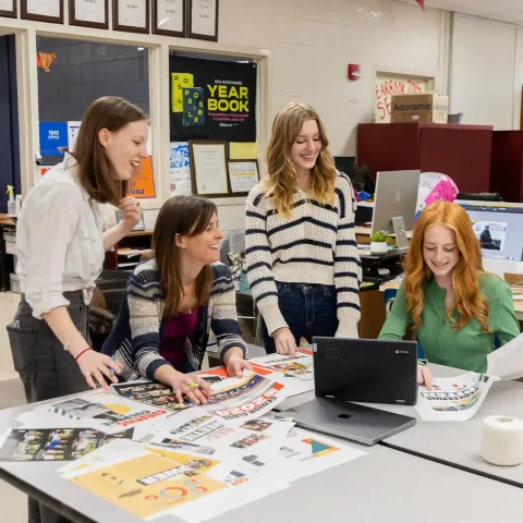
Yearbook design is where you can let your staff’s creativity run wild while determining how to portray the tone and message of the yearbook. Understanding the “why” is where your theme work begins. We’ve compiled resources to help inspire along the way!
Finding your why in yearbook design
Design comes down to identity and effective communication. When you understand the why, the how becomes easier.
In our Yearbook Suite curriculum book, “Understanding Why Design Matters,” author Mike Taylor, CJE, explains, “Publication design is more than placing pictures on pages. It’s more than picking pretty fonts. It’s more than using green, ‘because it’s my favorite color.’ Good designers evolve and good design communicates. It draws the reader in, it enhances stories, it drives your well-chosen theme.”
Where you start will also depend on your goal for the yearbook. If your design is currently more of a scrapbook collage, focus on choosing a dominant photo and sticking to a defined color and font palette. If you perform well at state competitions, but want to perform at national competitions, we can provide advanced design techniques to help enhance your yearbook too.
Where do I start?
One of the easiest and perhaps most enjoyable ways to start is exploring great design for inspiration. When you start to recognize great design, those elements will begin taking shape into your own yearbook. In our Terrific Trends for 2023 webinar, we’ve compiled cutting edge design trends of the new year.
Design can and should be found anywhere and everywhere, and it’s often overlooked. Talk to your yearbook rep about samples they can bring your staff to look through, including Possibilities vol. 9, and be sure to visit Walsworth’s Design Showcase Gallery.
Some schools find it helpful to start with our showcase gallery. They then come back after they’ve listened to webinars and podcasts and read eBooks and our curriculum. This helps them recognize the design elements better the second time. Our Theme Gallery is another excellent resource with examples of how theme is translated into the design of the yearbook and our Cover Gallery is filled with yearbooks you’ll judge by their cover in the best way.
Extra Resources
Our Selecting Your Color Palette eBook will help you understand color choices, how to pair them and how to utilize color palettes into your theme.
Browse the Caught Our Eye column in our latest edition of Idea File magazine for examples of spreads that made a lasting impression in 2022.
One of the best ways to make your design one for the books is to attend summer workshops, Adviser Academy and Elite Weekend. If you didn’t make it this year, talk to your staff and school administration about attending one (or all) next year. Our schools come out with detailed plans for their yearbook design after consulting with yearbook experts. In fact, 85% of our national award-winning schools attended an Elite Weekend – it’s that effective!
What Next?
Your rep can help you pick the best resources for your specific needs, so talk to them to make the best use of your time. And we’re always working on new content, so check back with us often to see what’s new.
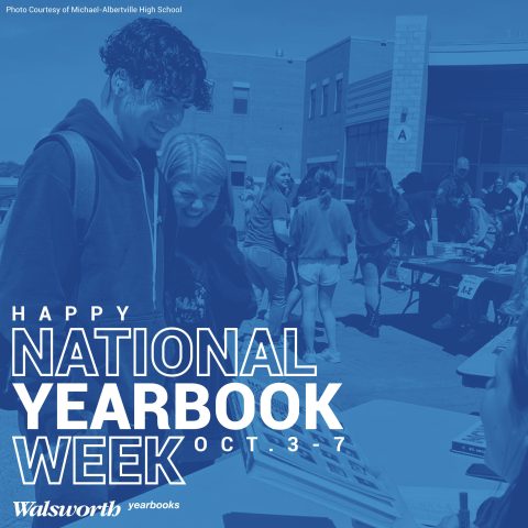
Keep striving and we know you will have a great year! Don’t forget to celebrate your achievements. After all, National Yearbook Week is all about celebrating yearbook and you!


